Preview image. Unlock full-res
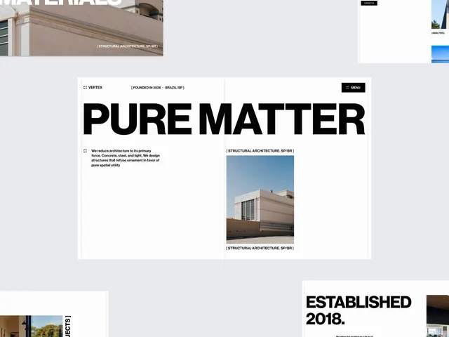
Architectural portfolio page using a Swiss-style asymmetric grid, pairing a large bold headline with a full-bleed photograph, rendered in a high-contrast monochromatic palette.
Summary
A Swiss-grid-based portfolio layout with a large, left-aligned headline, supporting body copy, and a right-aligned architectural photograph, creating a clean, structured two-column composition in black and white.
Visual description
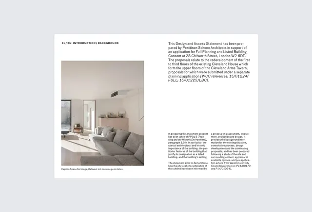
The page is divided into a two-column grid with generous margins. On the left, a dominant sans-serif headline reads "PURE MATTER" in uppercase, black, with significant letter spacing and weight. Below it, a shorter descriptive paragraph sits in smaller sans-serif type against white space. Small text labels appear left-aligned ("PORTFOLIO & BRANDING WORK"). On the right side, a rectangular architectural photograph is inset, showing a modern building exterior with a flat facade and minimal ornamentation. The photo is captioned beneath. At bottom right, the establishment year "ESTABLISHED 2018." is set in a smaller sans-serif. The entire composition sits on a clean white background with subtle warm-beige accents (footer area). Black, white, and warm-neutral grays dominate; the palette is restrained.
Key takeaway
The asymmetric grid pairing heavy typography on one side with a single, high-impact image on the other creates immediate visual hierarchy without decoration. The extreme type contrast (large bold headline plus minimal body) and generous whitespace enforce elegance and legibility. The structured grid and flush-left alignment signal sophistication without ornament.
Reuse notes
A strong template for architecture or design portfolio sites, and any professional practice needing serious, understated authority. Works best when you have a single hero image to showcase per section. Not suitable for dense information layouts or lifestyle brands needing personality.
More like this




Keep what you find
A free account saves references to boards and can send you a weekly email of picks based on what you save.
To see every result, go Pro.