Preview image. Unlock full-res
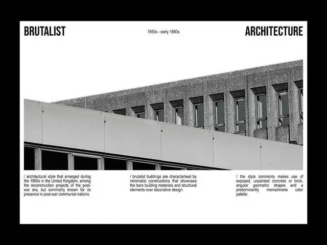
A documentary spread on Brutalist architecture (1950s-early 1980s) pairing a monumental concrete building photograph with explanatory text blocks.
Summary
A minimalist documentary spread on Brutalist architecture that dominates the composition with a photograph of a monumental concrete structure, accompanied by three small text blocks defining the movement.
Visual description
White background with black border frame. Large photograph of a brutalist building's facade: repetitive rectangular window openings in massive concrete, angled structural elements dividing horizontal sections. Below the image: three justified columns of small sans-serif body text on white, each paragraph aligned left-to-right. Top corners carry bold labels: "BRUTALIST" left, "ARCHITECTURE" right, with date range "1950s - early 1980s" centered. The photograph occupies 65-70% of the visible space; text and labels are deliberately minimal and subordinate.
Key takeaway
The hierarchy choice: let the photograph speak first, text explains second. The three-column layout for compact information. The generous white margins and black frame that make the image feel like a contained artifact. The typographic restraint in sans-serif body copy that does not compete with the visual.
Reuse notes
Strong model for architecture portfolios, design-history presentations, or editorial layouts where a single strong image needs supporting context. The photograph-to-text ratio works well for print and web layouts that prioritize visual impact over text density.
More like this

Keep what you find
A free account saves references to boards and can send you a weekly email of picks based on what you save.
To see every result, go Pro.