Preview image. Unlock full-res
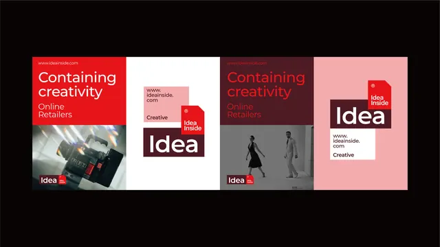
A bold corporate identity system with four-panel layouts using high-contrast red and dusty rose blocking, white sans-serif headlines, and product/lifestyle imagery.
Summary
A bold corporate identity system with four-panel layouts using high-contrast red and dusty rose blocking, white sans-serif headlines, and product and lifestyle imagery.
Visual description
Horizontal panel composition dividing the system into four distinct zones. Left panel: bright red background with white headline "Containing creativity / Online Retailers" and a photographic still of lighting/equipment. Center-left: white background with pink rectangular card and large maroon block containing white "idea" wordmark and red badge. Center-right: deep wine-burgundy background with red headline "Containing creativity / Online Retailers" and greyscale lifestyle photograph of two figures. Right panel: soft dusty-rose background with large white "idea" wordmark, overlaid red badge with trim, and minimal typography. Black hairlines separate all zones. White sans-serif typeface at large scale, confident and clean. Color palette alternates between saturated primary red, muted mauve-pink, deep burgundy, and near-black, unified by high contrast.
Key takeaway
A locked four-panel system demonstrating how rigid geometric division and one aggressive accent color (red) can carry a corporate brand across varied content. The maroon/pink/red progression creates hierarchy without complexity. Combining photography, pure typography, and color-field planes on a modular grid adapts the system to product showcase, brand story, or direct marketing without redesign.
Reuse notes
Effective template for retail brands, creative agencies, or B2B services needing to present diverse assets (products, people, abstract concept) cohesively. The high contrast and bold color blocking read well at small scale and maintain legibility on printed collateral. Best paired with strong product photography and confident brand messaging.
More like this

Keep what you find
A free account saves references to boards and can send you a weekly email of picks based on what you save.
To see every result, go Pro.