Preview image. Unlock full-res
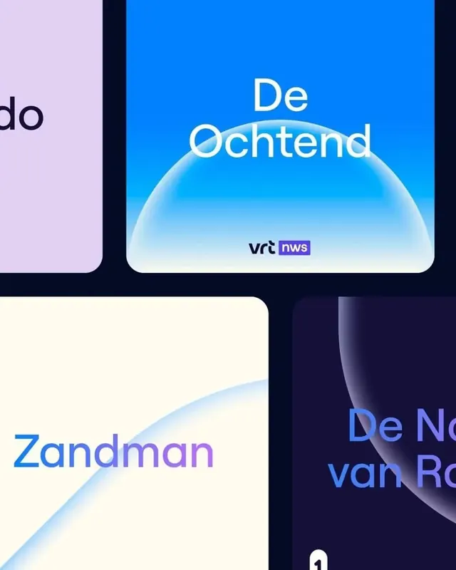
A broadcast graphics system for VRT using soft organic blob shapes, pastel-to-saturated gradients, and modular title cards for program promotion.
Summary
A broadcast graphics system for VRT (Flemish public media) using soft organic blob shapes, pastel-to-saturated gradients, and modular title cards for program promotion.
Visual description
Four modular promotional cards arranged in a grid on a near-black background. Each card pairs large sans-serif headline text (white or pale lavender) with a soft organic blob shape. Top-left card: full saturated bright blue background with "De Ochtend" (The Morning) in white, and a cream-colored curved blob spanning left-to-center. Top-right card: pale lavender background with "De Ochtend" in red, another organic curve, and "vrt nws" purple badge bottom-right. Bottom-left card: cream-to-white background with "Zandman" (Sandman) in bright blue sans-serif, and a soft blue gradient blob suggesting a dune or landscape form. Bottom-right card: dark navy background with "De Nacht" (The Night, partially visible) in pale lavender, and gradient blob from blue through purple. Organic shapes use soft feathered edges and pastel-to-bright gradient fills that suggest landscape, sky, or abstract landscape themes appropriate to each program's narrative.
Key takeaway
A simple modular system where one design move (the soft gradient blob) anchors every variant. Changing the blob's color, gradient direction, and underlying card background instantly shifts the program's mood without touching type or layout. Organic shapes soften technical broadcast materials and read as modern without being trendy. Pairing cool blues and purples with occasional warm cream grounds keeps the palette coherent across diverse program identities.
Reuse notes
Ideal for media organizations, streaming platforms, or content hubs launching multiple show brands that need visual cohesion without looking templated. The blob metaphor works for music, talk, documentary, or youth programming. Works equally well on-air, in app navigation, and in social promotion. Best when each program gets its own dedicated color from the gradient palette to aid viewer recognition.
More like this




Keep what you find
A free account saves references to boards and can send you a weekly email of picks based on what you save.
To see every result, go Pro.