Preview image. Unlock full-res
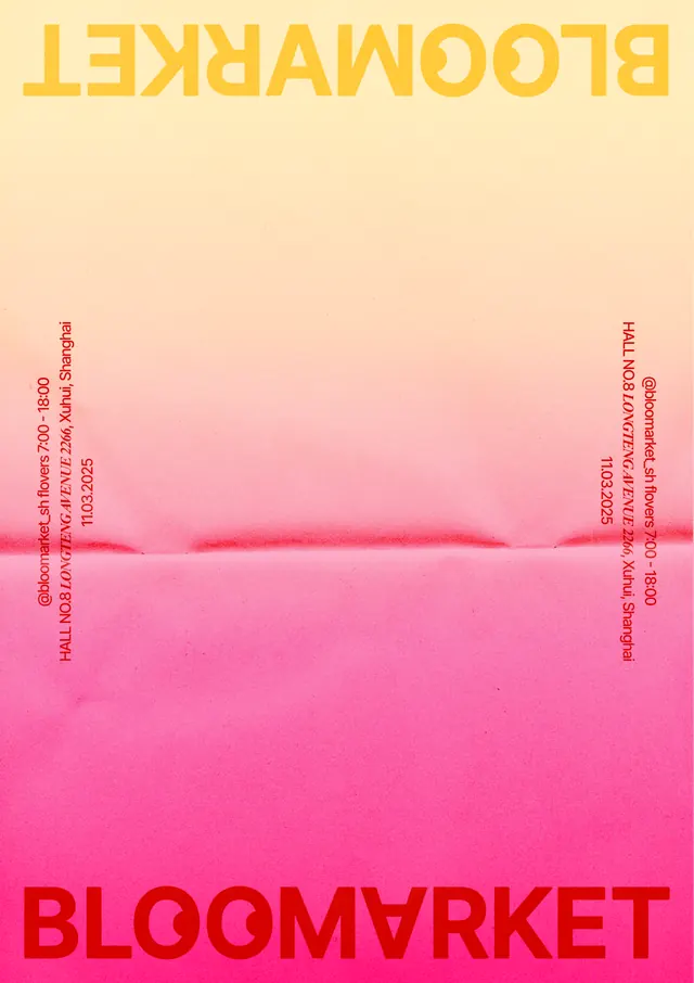
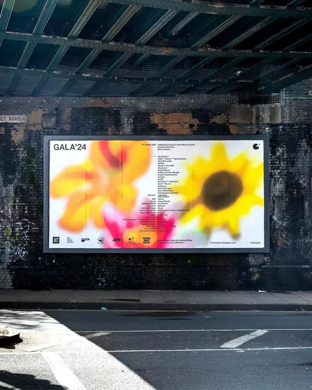
Bold typographic poster featuring display typeface in yellow and red reversed on a gradient transitioning from soft peach at top to hot pink at bottom.
Summary
Vertical poster specimen of a bold sans-serif display typeface in yellow and red, inverted and rotated across a gradient background that transitions from pale peach to saturated hot pink.
Visual description
Vertical rectangular composition with soft cream-to-peach gradient at top transitioning through salmon tones to bright hot pink at bottom, creating a smooth gradient mesh effect. Top third displays brand wordmark "BLOOMMARKET" in all-caps bright yellow sans-serif, rotated upside-down and reversed. Text runs along the left and right edges in small red caps, also upside-down. Center and lower areas show large block of upside-down red sans-serif letters spelling "BLOOMMARKET" at bottom in heavy weight display face. The gradient background creates a soft atmospheric quality in upper half with more saturated color intensity in lower half. No additional imagery or decorative elements.
Key takeaway
The gradient mesh background technique moving from unsaturated to highly saturated warmth. Using reversed/rotated text as both functional typography specimen and decorative framing device. High-saturation pink and yellow combination that reads as contemporary and fresh without feeling overwrought.
Reuse notes
Strong for retail, marketplace, or event marketing where energetic youth-forward positioning is desired. Works well as event poster, product launch announcement, or seasonal promotion. The gradient saturation shift adds depth without complexity. Best on portrait format. Avoid if audience skews corporate or conservative, as the bold hot-pink saturation signals playful, trendy positioning.
More like this


Keep what you find
A free account saves references to boards and can send you a weekly email of picks based on what you save.
To see every result, go Pro.