Preview image. Unlock full-res
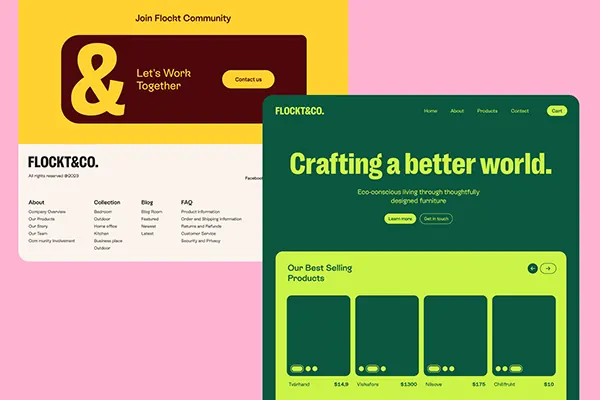
Collage of digital and print mockups using bold mustard yellow, forest green, and lime blocks with friendly sans-serif type for a sustainable furniture brand.
Summary
Brand system collage combining vibrant mustard yellow, forest green, and lime blocks with friendly sans-serif typography for a sustainable furniture and lifestyle retailer.
Visual description
A multi-card mockup showing a consistent brand language across touchpoints. Top left: a cream background with "Join Flocit Community" and a dark brown rounded card saying "Let's Work Together." Top right: a website hero with dark green background, bold yellow "Crafting a better world" headline, and a lime green product grid below. Bottom left: off-white business card or footer showing "FLOCKT&CO" with navigational links in black serif. Each block uses generous spacing and clean horizontal stacking to balance the bold hue combinations. The palette avoids looking childish by pairing intense colors with neutral backgrounds and weighted typography.
Key takeaway
The color-blocking strategy of using one intense primary color per section (green for one, yellow for another, lime for the grid) while always anchoring with neutral space. The consistent sans-serif weight across headlines and supporting text builds system coherence. High-contrast color combinations that feel modern rather than chaotic.
Reuse notes
Ideal for sustainable, eco-conscious DTC brands, furniture retailers, and lifestyle e-commerce looking to appear friendly yet modern. The color palette works particularly well for product grids or multi-section landing pages. Pairs well with organic photography or simple product mockups. Avoid using all three colors equally; let one dominate per section.
More like this





Keep what you find
A free account saves references to boards and can send you a weekly email of picks based on what you save.
To see every result, go Pro.