Preview image. Unlock full-res
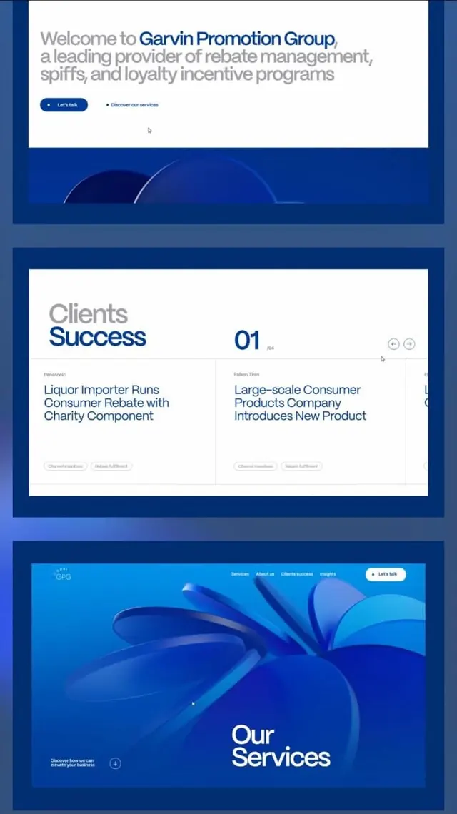
Vertically stacked three-section hero and case-study grid for a rebate and loyalty management firm, unified by deep blue panels and curved abstract shapes.
Summary
Vertically stacked three-section hero and case-study grid for a rebate and loyalty management firm, unified by deep blue panels and curved abstract shapes.
Visual description
The layout divides into three stacked hero cards separated by dark blue gaps. Top section: white card with gray headline "Welcome to Garvin Promotion Group" anchored by tagline text in gray, two CTA buttons (primary solid blue pill, secondary outline). Middle section: white card titled "Clients Success" featuring a "01" badge and two case-study cards with titles and gray tag labels, on a navy background. Bottom section: bright blue hero with large curved 3D shapes and overlaid nav bar, featuring "Our Services" headline and secondary CTA in white. The color palette alternates white card backgrounds with deep-navy frame edges; curved wave shapes in blue gradient from dark to cyan create visual continuity and modern dynamism.
Key takeaway
The stacked card + spacer pattern creates clear visual rhythm; each card is a contained narrative unit. The curved geometric shapes (especially in the service section) add softness to the corporate grid. Tight headline hierarchy and paired CTA buttons (primary + secondary) give users clear guidance without noise.
Reuse notes
Ideal template for B2B services, SaaS platforms, and case-study showcases where you need to stack hero, social proof, and service overviews. The blue-heavy palette signals trust and stability; works well for finance, consulting, incentive programs. Pair the modular card pattern with your own case studies or service descriptions.
More like this


Keep what you find
A free account saves references to boards and can send you a weekly email of picks based on what you save.
To see every result, go Pro.