Preview image. Unlock full-res
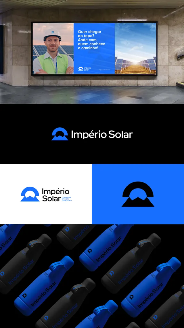
Solar energy brand identity system pairing a curved-sun icon mark with logotype and application examples on blue and monochrome backgrounds.
Summary
Solar energy brand identity showing a curved-sun icon mark, wordmark, and logo explorations across white and blue colorways, anchored by a photograph of a utility worker on a billboard.
Visual description
A vertical stack of brand applications: at top, a billboard mockup with a photograph of a worker in safety gear overlaid with the Império Solar brand layout on a sky-blue panel. Below that, the primary wordmark centered on a blue background. Then two logo mark variations (the sun icon with curved, nested arcs, shown on white and solid blue backgrounds) and a repeating geometric pattern of cylindrical solar tubes in angled arrangement. The mark itself is simple: a curved semicircle filled with blue, stacked with a smaller curved shape below, creating the silhouette of a rising sun. Sans-serif wordmark is rendered in blue on light grounds and white on dark.
Key takeaway
The simple curved-arc sun mark (highly legible, symmetrical, scalable). The color discipline: one accent blue throughout, paired with monochrome backgrounds (no color noise). The pattern of logo-on-white, logo-on-blue, and mark-only variations showing system thinking without clutter.
Reuse notes
Reach for this when designing renewable-energy or utility b2b brands. The curved geometric mark is strong enough to carry standalone; the billboard photograph grounds it in real-world context. Works equally at small scale (icon) and large (billboard). The neutral palette with one accent is ideal for corporate credibility.
More like this





Keep what you find
A free account saves references to boards and can send you a weekly email of picks based on what you save.
To see every result, go Pro.