Preview image. Unlock full-res
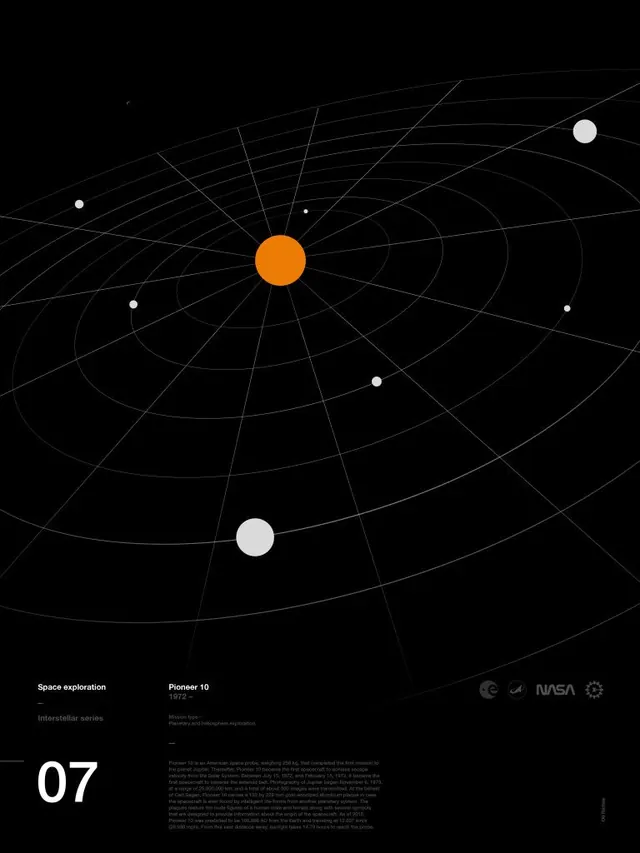
Minimalist radial diagram with concentric orbital paths and white nodes on black, centered on bold orange dot, labeled with space mission data and historical context.
Summary
NASA Pioneer 10 space mission infographic with radial orbital grid system, centered orange sun node, white satellite nodes, and small-scale mission type and historical narrative in bottom-right corner.
Visual description
Black canvas holds a radial geometric system: concentric curved lines and radiating rays emanating from a central point, creating a planetarium-like grid. At the center, a bold orange circle serves as the primary focal point. Scattered across the orbital field are seven white circles of varying sizes, positioned at different radii, suggesting celestial bodies or spacecraft positions. Bottom-left displays large white numerals "07" (mission number). Top-left and center-left contain small-scale white sans-serif text blocks: "Space exploration," "Pioneer 10," mission descriptor, and historical passage about the spacecraft. Top-right shows navigation iconography (cycle, settings, NASA seal). The palette remains strictly warm-neutral and monochromatic: orange, white, and charcoal against deep black.
Key takeaway
The radial composition creates visual hierarchy and scientific credibility without clutter. Warm accent (orange) against a sea of black and white draws the eye naturally to the subject. Monochromatic approach with a single warm tone reads as vintage and trustworthy. Mixing geometric structure with subtle text creates layered information density.
Reuse notes
Excellent template for scientific, historical, or data-driven content. Works for mission tracking, timeline graphics, orbital animations, or historical documentation. The retro aesthetic lends authority and intrigue without feeling dated. Requires sufficient space for the radial grid; crowded contexts will lose the elegance. The orange-on-black accent pattern is flexible; substitute other warm hues for different brand contexts.
More like this



Keep what you find
A free account saves references to boards and can send you a weekly email of picks based on what you save.
To see every result, go Pro.