Preview image. Unlock full-res
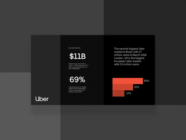
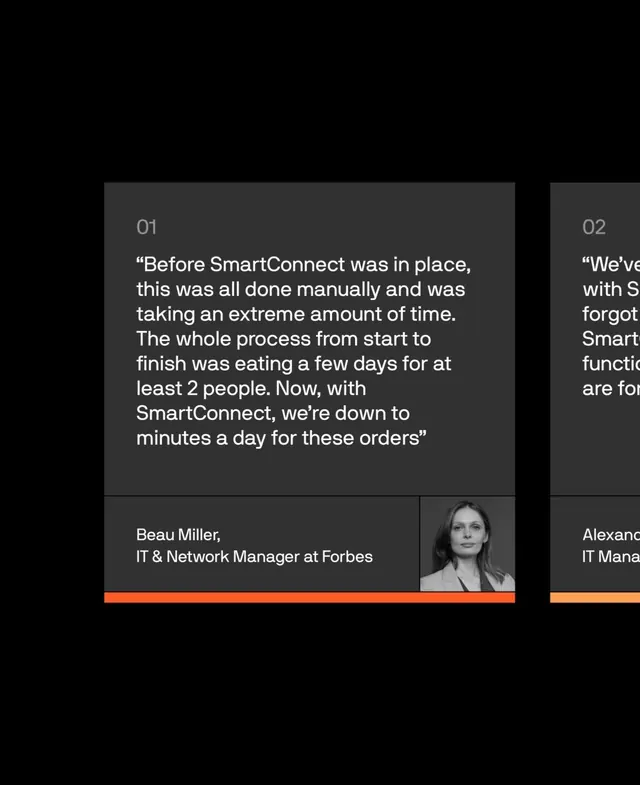
Dark corporate infographic with sidebar layout, white typography on charcoal, and a single orange accent panel highlighting key metrics.
Summary
A dark, sidebar-based infographic presenting corporate metrics with strict hierarchy and an orange accent panel.
Visual description
Left sidebar in black contains white sans-serif label text ("Uber") and smaller secondary copy. Center and right panels stack data: a large white statistic ("$11B", "69%") in clean typography sits above smaller descriptive text on a dark charcoal ground. One orange/red rectangular block breaks the monochrome palette, adding visual focus and emphasis to a key metric. All elements rest on a dark gray background with clear spatial separation between zones.
Key takeaway
The single warm accent breaking an otherwise cool, neutral palette creates immediate visual hierarchy without clutter. The strict three-column panel rhythm makes data scannable. Minimal sans-serif labels paired with large numbers leverage contrast and sizing to guide eye flow.
Reuse notes
Strong pattern for B2B dashboards, financial dashboards, or any metric-heavy layout needing clarity without decoration. Works especially well when one KPI deserves to stand out. Scale the orange accent proportionally if adding more metrics.
More like this
Keep what you find
A free account saves references to boards and can send you a weekly email of picks based on what you save.
To see every result, go Pro.