Preview image. Unlock full-res
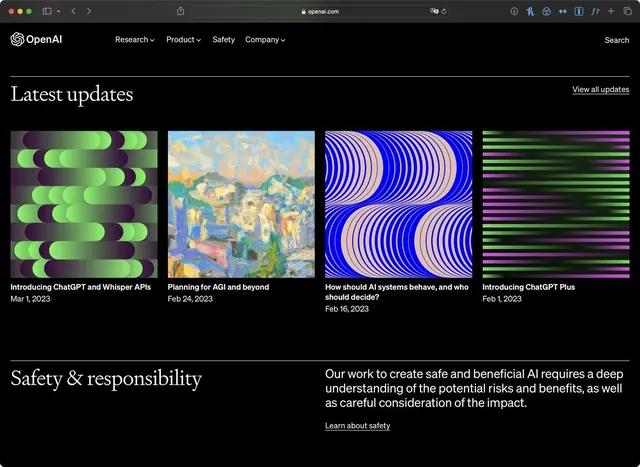
Dark-mode corporate website section showcasing feature cards with animated gradient patterns, set against a black background with serif headlines and structured grid layout.
Summary
A dark corporate website section from OpenAI featuring a "Latest updates" headline and four feature cards with distinct gradient-based illustrated patterns, grouped under a "Safety & responsibility" statement.
Visual description
A black navigation bar at the top contains the OpenAI logo and menu links (Research, Product, Safety, Company) with a search input. Below, large serif headline "Latest updates" sits in the upper left. Four tall rectangular cards follow in a grid, each with a unique animated-gradient pattern: curved strokes in lime-green-to-purple; warm impressionist brushwork in golds and teals; bold concentric arcs in electric blue and purple; horizontal neon lines alternating cyan and magenta. Each card includes a date-stamped title in white sans-serif. Below, another serif headline "Safety & responsibility" precedes body copy in light gray text, with a "Learn about safety" link.
Key takeaway
The confident use of animatable gradients as visual focal points that balance dark, serious typography; the decision to apply distinct gradient treatments to each card (rather than repeating one pattern) to create visual variety without clutter; the pairing of serif headlines with sans-serif body and meta-text, establishing hierarchy and warmth on a purely dark canvas.
Reuse notes
Ideal for AI, software, or research-heavy brands needing to convey innovation and seriousness simultaneously. The dark background with high-contrast gradients works well for tech audiences and reduces visual fatigue on long pages. The grid of cards is flexible; update patterns or illustrations without breaking the system. Animated gradients (shimmer, shift) would enhance perceived motion and engagement, especially on hero sections or update feeds.
More like this





Keep what you find
A free account saves references to boards and can send you a weekly email of picks based on what you save.
To see every result, go Pro.