Preview image. Unlock full-res
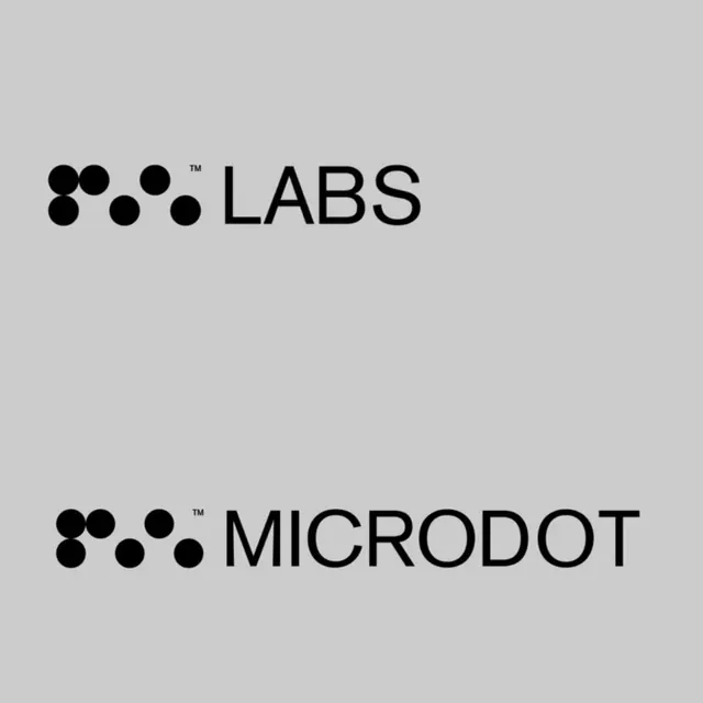
Paired wordmarks with a shared circle-cluster symbol: 'LABS' and 'MICRODOT' in sans-serif, each with a unique geometric mark built from six dots arranged in a tessellating pattern.
Summary
Two complementary wordmarks, each pairing a sans-serif name with an identical abstract symbol of six black circles arranged in a loose cluster, unified by a minimalist visual language optimized for logos and identities in scientific and tech contexts.
Visual description
Light gray background with two stacked wordmark compositions. Each has the same mark: six uniform circles in various arrangements (top group forms a wider shape, bottom group more compact), positioned immediately left of the sans-serif wordmark in all capitals. Top reads "LABS" with a superscript trademark symbol; bottom reads "MICRODOT" with a superscript trademark symbol. Both use a tight, geometric sans-serif (no contrast in stroke weight). Black type and symbol on light background, neutral and highly legible. White space is generous around each mark. No color, no baseline, pure mark-and-type geometry.
Key takeaway
The abstract dot-cluster mark works as a reusable icon across applications (favicon, app button, etc.) because it is simple, scalable, and self-contained. The mark's geometric purity and the tight lockup between mark and type create institutional gravity. The repetition of the identical mark across two product names (LABS / MICRODOT) suggests a modular brand system where the mark anchors multiple sub-brands.
Reuse notes
Strong for technology, science, developer tools, and SaaS brands that want to signal precision and reliability. The monochrome mark renders well at small scales. Works on both light and dark backgrounds, though the contrast shown here (black on light gray) is canonical. Pair with precise, functional typography, not decorative.
More like this


Keep what you find
A free account saves references to boards and can send you a weekly email of picks based on what you save.
To see every result, go Pro.