Preview image. Unlock full-res
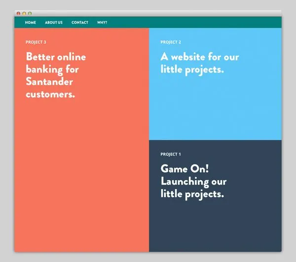
A flat portfolio grid dividing three projects into asymmetrical color-blocked cards: coral (left), cyan (top right), navy (bottom right), each with white headlines anchoring distinct product narratives.
Summary
Three service/product offerings displayed as asymmetrically arranged color-blocked cards, each paired with a bold sans-serif headline describing a distinct business objective.
Visual description
Three rectangular cards arranged in an L-shaped grid: a tall coral card on the left reads "Better online banking for Santander customers"; a cyan card top right reads "A website for our little projects"; a dark navy card bottom right reads "Game On! Launching our little projects." Light grey browser chrome frames the top edge. Cards are uniform in thickness but vary in width and height to create visual rhythm. Headlines are set in a bold, uppercase-friendly sans-serif in white (max contrast against saturated backgrounds). No imagery, no icons, no supporting text visible: the layout and color do the organizational work.
Key takeaway
Complementary color blocking (warm coral, cool cyan, dark navy) creates immediate visual separation without logos or labeling. The asymmetrical arrangement prevents monotony while maintaining a strict grid snap. Dense, heavyweight sans-serif headlines dominate the space; the restraint in copy forces content clarity. The light browser chrome subtly grounds the design in a web context.
Reuse notes
Effective for fintech or B2B service portfolios where each offering is a distinct product or customer segment. The three-card cap prevents visual overwhelm. The color palette here is saturated enough to work on any background, but best in neutral/white contexts. Scaling to more than four cards would require sub-gridding or pagination; it's sized for a homepage hero or capabilities section.
More like this







Keep what you find
A free account saves references to boards and can send you a weekly email of picks based on what you save.
To see every result, go Pro.