Preview image. Unlock full-res
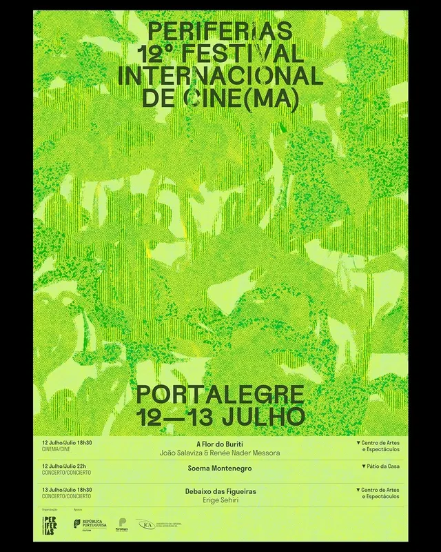
A film-festival poster in a single lime-green monochromatic palette with abstract organic texture, centered all-caps typography, and an event schedule arranged vertically.
Summary
A film-festival poster in a single lime-green monochromatic palette with abstract organic texture, centered all-caps typography, and an event schedule arranged vertically.
Visual description
Black border frame on all edges. The full interior is lime-green with a dense, organic abstract texture of overlapping circles, dots, and irregular mark-marks in lighter and darker lime shades, creating visual rhythm without representational imagery. Centered in the upper half: "PERIFERIAS 12 FESTIVAL INTERNACIONAL DE CINE(MA)" in large, extended all-caps sans-serif in black, reading left-to-right. Lower center: "PORTALEGRE 19-13 JULHO" (dates and location) in equally bold all-caps. Below that, a multi-column event schedule in small-scale black sans-serif, listing film titles, times, venues (Centro de Artes + Espectaculos, Patio da Casa), and curators' names. Small institutional logos in black at bottom-left. The monochromatic approach (green-on-black text, black-on-green background) creates maximum legibility while the textured background adds visual complexity and artistic credibility.
Key takeaway
The monochromatic lime-green palette applied across the entire poster (background, texture, typography) creates a distinctive, memorable brand color. The abstract organic texture fills the space without diluting the typography hierarchy. Condensed sans-serif in all-caps commands attention and scans quickly at distance. Placing the practical schedule info (dates, times, venues) small and centered keeps the focus on the festival identity and title.
Reuse notes
Strong for cultural events, cinema/arts festivals, theater, music venues, and creative industries where a single bold color and high typographic hierarchy are advantages. Works best at poster scale where the abstract texture can be appreciated up close and the headline reads from a distance. The monochromatic approach reduces production cost while the organic texture keeps the design from feeling sterile. Not suitable for information-dense content (use sparingly with text).
More like this


Keep what you find
A free account saves references to boards and can send you a weekly email of picks based on what you save.
To see every result, go Pro.