Preview image. Unlock full-res
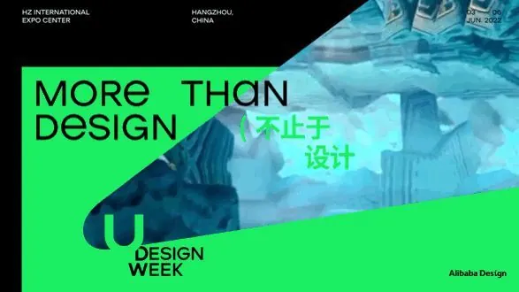
Event poster for a design week exhibition using a dynamic diagonal split, neon lime-green typography against teal architectural photography on a black background.
Summary
Event poster for a design week using a dynamic diagonal split, neon lime-green typography against teal architectural photography on a black background.
Visual description
A full-bleed poster composition split diagonally from upper left to lower right. The left side is neon lime-green containing bold, large sans-serif display type reading "MORE THAN DESIGN" in English and Chinese characters. The right side is dark teal-blue, showing a photograph of architectural elements with modern buildings and a person. A diagonal stripe of lime-green separates the two halves. The bottom left contains smaller text reading "DESIGN WEEK" and a sponsor credit. White and dark text maintain contrast across both color zones.
Key takeaway
The neon green against cool-toned blue architecture creates extreme vibrancy through contrast, not saturation. The diagonal division cleanly separates typography from imagery without overlap. Using the same neon stripe as both a text background and structural divider unifies the composition economically.
Reuse notes
Effective template for design conference, creative industry, or urban development event promotions. The architectural photography reads as aspirational; substitute with any structured imagery. Works at both large poster scale and social media. The color pair (neon lime and dark teal) is striking but may not suit conservative brands.
More like this

Keep what you find
A free account saves references to boards and can send you a weekly email of picks based on what you save.
To see every result, go Pro.