Preview image. Unlock full-res
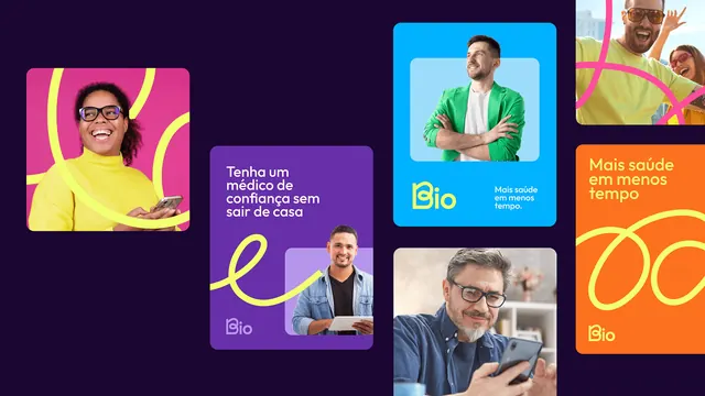
Healthcare app promotional grid with bold neon gradient cards, headshot photography, and contrasting typography on deep purple background.
Summary
A promotional grid of six asymmetrically sized cards alternating photography and typography against a deep indigo background, each card filled with a vivid gradient.
Visual description
Dark navy-purple background (near-black) supporting a non-uniform grid of cards. Top-left card: hot-pink-to-bright-yellow gradient with portrait of woman in glasses against curved yellow brushstroke (labeled "Tenha um médico de verdade, sem sair de casa" = "Have a real doctor without leaving home"). Top-center: bright cyan square with headshot of man in green shirt, right-aligned text label "Bio" in white plus descriptive text. Top-right: saturated orange card with warm photo of man and child, white text "Mais saúde em menos cliques" = "More health in fewer clicks". Middle row left: deep purple vertical card with italic yellow script "a" and dark portrait (doctor or authority figure) below. Middle-right: large dark teal-blue card with confident male portrait in professional pose. Bottom row features additional cards with similar treatment: orange neon elements, cyan-blue photography cards, deep purple with yellow typography accents. All text set in crisp, modern sans-serif, some all-caps, some sentence case. Branding: "Bio" logo and "@ISOGOTAEK" visible on select cards.
Key takeaway
High-contrast dark background makes neon gradients sing without needing heavy saturation tuning. Asymmetric grid (mixing tall, wide, and square cards) feels dynamic and editorial rather than monotonous. Bold typography layered in bright yellow or white over gradients reads immediately. Mixing portrait photography with pure gradient cards creates visual rhythm: human warmth alternates with graphic boldness. Each card stands alone as a complete pitch yet the whole grid reads as one narrative.
Reuse notes
Ideal for healthcare, wellness, or SaaS apps targeting fast conversion and mobile-first browsing. The dark background screens well on phone. Works well for user testimonials, feature highlights, or pricing card stacks. Avoid if brand voice is corporate or minimalist; this approach requires confident color use and permission to be loud. Photography must be warm and approachable to balance the electrified gradients.
More like this


Keep what you find
A free account saves references to boards and can send you a weekly email of picks based on what you save.
To see every result, go Pro.