Preview image. Unlock full-res
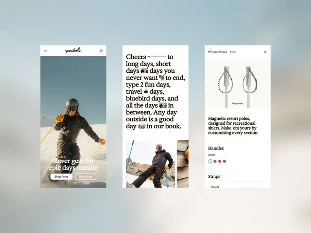
Mobile product browsing layout for outdoor gear featuring hero photography paired with magazine-style editorial copy and component showcase cards.
Summary
Mobile browsing experience for outdoor gear featuring full-bleed photography, lifestyle messaging, and detailed product specification cards in a calm color palette.
Visual description
Three stacked panels on soft blue-grey background. Left panel (hero): skier in dark winter gear against mountain snow, white header with "Yardsale" logo and shopping icon, white buttons for "Shop Poles" and "Shop Bags" overlaid. Center panel: serif headline "Cheers to long days, short days" with emoji breaks, flowing body copy describing day types, white background with lifestyle photography thumbnails below. Right panel: product detail card for "P1 Resort Poles" showing two teardrop-shaped pole designs with optional separation, description text, color handle options (white, red, blue dots), and "Straps" section below. All panels use generous white space, soft grey typography, and photography as key visual weight.
Key takeaway
Color-coded interactive product specs (handle colors as clickable swatches), strong photography hierarchy that leads the viewer into brand story before specs, and a modular card system that scales from hero to detailed product without feeling cramped.
Reuse notes
Effective for retail and ecommerce mobile patterns, especially lifestyle and sporting goods where narrative and aspiration matter as much as specs. The serif headline paired with sans-serif body creates a readable contrast. Works well for multi-product browsing where you want to establish brand mood before diving into options.
More like this
Keep what you find
A free account saves references to boards and can send you a weekly email of picks based on what you save.
To see every result, go Pro.