Preview image. Unlock full-res
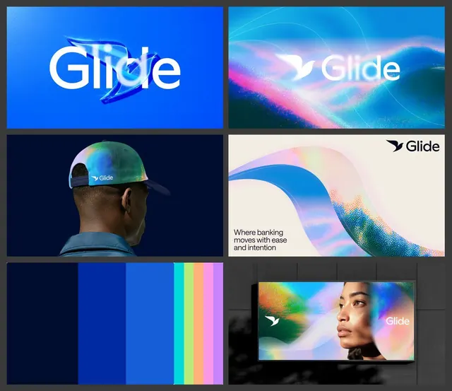
Fintech brand identity system (Glide) showcasing fluid blue-to-pink-to-teal gradients, abstract wave forms, photography integration, and color palette across logo, marketing, and product applications.
Summary
Fintech brand identity (Glide) combining fluid gradient waves, abstract forms, and photography to communicate ease and trust in banking services.
Visual description
A brand-guideline composition in a 2x3 grid showcasing six brand applications. Top-left: Glide logo in white with an abstract feather-like accent on navy-blue background. Top-right: fluid gradient landscape (teal to pink to white) with Glide logo and "Where banking moves with ease and intention" tagline in sans-serif on light background. Middle-left: person wearing a Glide-branded baseball cap with rainbow-gradient wave pattern against dark background. Middle-right: abstract wave form (blue-to-pink gradient with stippled texture) on off-white background with small Glide logo. Bottom-left: vertical color-palette strip showing deep navy, blues, cyan, and pastel gradient swatches. Bottom-right: portrait of a person overlaid with an iridescent gradient wave and Glide logo.
Key takeaway
The modular wave and gradient system that threads consistently through all brand touchpoints, creating visual unity across photography, logo, and abstract elements. The restriction to a cool palette (navy, blue, teal, pink accents) keeps the system cohesive. The abstract forms are organic but geometric enough to feel trustworthy. The tagline placement (lower-right corner of key-image variant) is understated and sophisticated.
Reuse notes
Excellent reference for fintech, banking, or payment-service brands seeking to feel modern and accessible without appearing chaotic. The gradient approach works because it pairs abstract visual interest with calm, cool colors. The integration of photography (portraits, real people) with abstract waves shows how to humanize technical services. Palette can be adapted; keep the gradient flow and wave-form logic.
More like this





Keep what you find
A free account saves references to boards and can send you a weekly email of picks based on what you save.
To see every result, go Pro.