Preview image. Unlock full-res
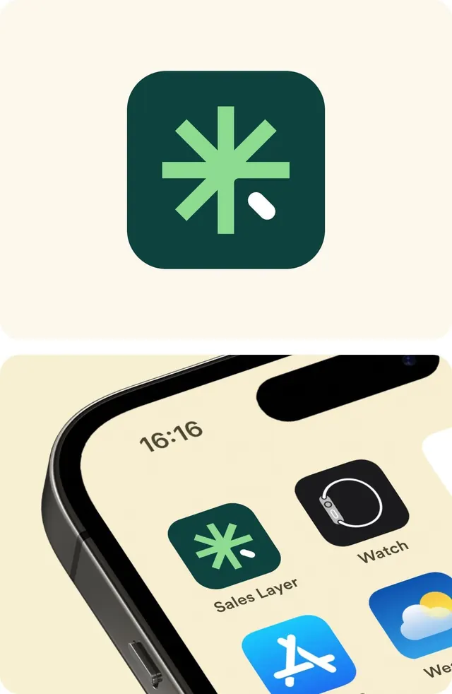
Minimalist app icon featuring a plus cross in bright sage green on a dark teal rounded square, with a subtle white cursor shape accent.
Summary
Minimalist app icon featuring a plus cross in bright sage green on a dark teal rounded square, with a subtle white cursor shape accent.
Visual description
Top half: a single app icon in isolation on cream background. Centered bright lime-green plus/cross symbol with angled shoulders radiating outward, with a small white curved shape in the lower right suggesting a cursor or click gesture. All on a dark teal rounded-corner square. Bottom half: the same icon shown on a device mockup within an iOS app grid (16:16 aspect), alongside other app icons labeled Sales Layer and Watch, with App Store icon visible below.
Key takeaway
The plus symbol's arms angle subtly (not perfectly orthogonal) to feel more organic and contemporary than a strict geometric cross. The white cursor micro-accent in the corner breaks symmetry and hints at interactivity without adding visual noise. The dark teal background ensures the bright green pops for app store visibility and accessibility.
Reuse notes
A strong pattern for healthcare, wellness, or productivity app icons. The cursor accent works for appointment-booking or CRM tools where the call-to-action is user input/selection. Test the icon at small sizes (16x16, 32x32) to ensure the accent remains legible. The color contrast exceeds WCAG AA standards, supporting accessibility guidelines for app store listings.