Preview image. Unlock full-res
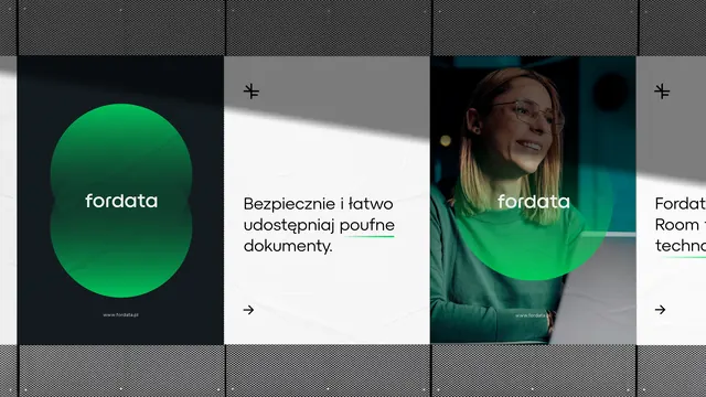
Modular multi-panel web carousel with dark gray, white, and teal-accented cards showcasing a company, photography, and feature copy in clean sans-serif type and centered circular brand marks.
Summary
A modular multi-panel web carousel showing Fordata with alternating dark gray, white, and teal-accented cards, each featuring a brand circle, copy, or lifestyle photography, separated by thin grid lines.
Visual description
Four visible vertical panels separated by thin diagonal hatching dividers. Left: dark gray background with a centered teal circular brand mark and "fordata" wordmark in white sans-serif underneath. Center-left: white background with Polish-language copy "Bezpieczenie i latwo udostepniaj poufne dokumenty" (a feature description) and a small right-arrow navigation indicator. Center-right: lifestyle photograph of a woman in glasses smiling, wearing a green tinted overlay, with "fordata" centered in a teal circular mark on the image. Far right: gray background (partially visible) with cropped copy "Fordat Room" and "technc" (truncated). Thin black dividing lines and faint grid pattern create a modular rhythm. All type is clean, sans-serif, and left/center-aligned.
Key takeaway
The centered circular brand mark as a modular component repeated across sections creates consistency and visual rhythm. Alternating dark, light, and image-heavy panels maintain viewer interest while keeping the design scannable. The teal accent color draws the eye without overwhelming. Thin grid dividers and negative space give the carousel a deliberate, structured feel that reads as secure and professional.
Reuse notes
Strong template for product or SaaS website carousels. Works well for companies wanting to show people, features, and security messaging side by side. The high-contrast color scheme photographs well and remains legible on mobile. Polish language visible here, but design is language-neutral. Copy the panel structure for any B2B brand story; the teal swaps to your primary color.
More like this








Keep what you find
A free account saves references to boards and can send you a weekly email of picks based on what you save.
To see every result, go Pro.