Preview image. Unlock full-res
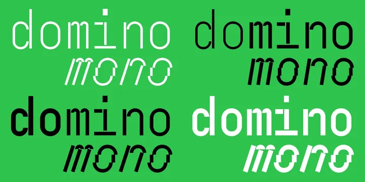
A set of four typographic logo variations for 'domino mono' featuring different weights and layouts.
Summary
A set of four typographic logo variations for 'domino mono' featuring different weights and layouts.
Visual description
Four variations of the text 'domino mono' arranged in a 2x2 grid. The designs use a high-contrast green and black color scheme with varying font weights and placements for the 'mono' descriptor.
Key takeaway
The design demonstrates how varying font weights and spatial relationships can create distinct brand identities within a single visual system.
Reuse notes
Use as a reference for establishing typographic hierarchy and weight contrast in a brand identity.
More like this
Keep what you find
A free account saves references to boards and can send you a weekly email of picks based on what you save.
To see every result, go Pro.