Preview image. Unlock full-res
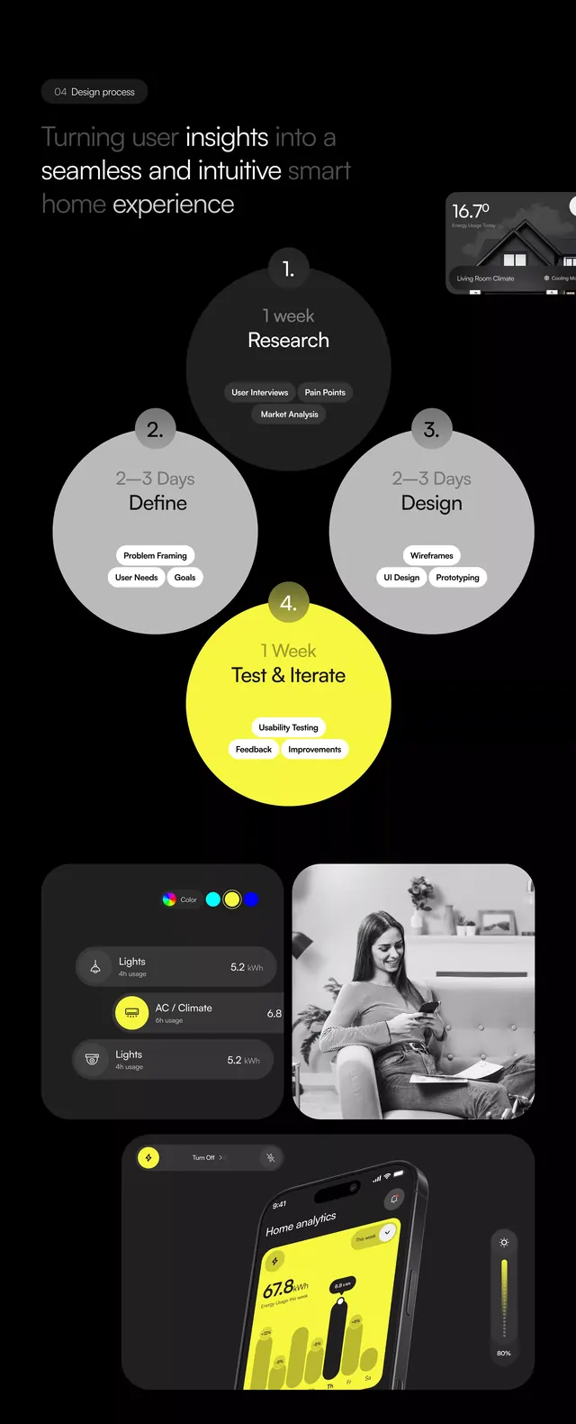
Software interface design pairing a circular node hierarchy at top with layered product mockups and photography below, unified by dark backgrounds and a single vibrant yellow accent color.
Summary
Product design presentation combining a circular workflow diagram (Research, Define, Test & Iterate) with mobile app screens, interface panels, and lifestyle photography, accented with a single bright yellow highlight on a dark background.
Visual description
Vertical scrolling composition in black and charcoal. At top: a circular node diagram with three connected circles labeled Research, Define, and Test & Iterate (center), all in light gray with black text on dark ground. Below: horizontal layout mixing a mobile phone mockup (left), a grayscale portrait photograph (center), and a dark interface panel on the right side. Bottom section: four interface cards arranged in a loose grid, including data visualizations, settings panels, and yellow-accented UI elements. Yellow appears only as a bright highlight on a test-and-iterate button and secondary UI components, creating strong focal points against the overall darkness.
Key takeaway
The yellow-on-black accent pattern: a single bright color deployed sparingly across a dark interface acts as both a visual guide and a brand anchor. The circular hierarchy as a process map, clearly establishing workflow phases. Mixing abstract UI wireframes with real photography to humanize technical product flow.
Reuse notes
Highly effective for SaaS, developer tools, and AI products that need to convey both technical rigor and human-centered design. The dark background + single accent color is mobile-friendly and works well in presentations. The circular node pattern is especially strong for methodology or multi-stage processes (research, design, test, iterate, deploy).
More like this


Keep what you find
A free account saves references to boards and can send you a weekly email of picks based on what you save.
To see every result, go Pro.