Preview image. Unlock full-res
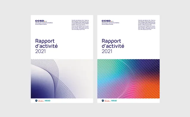
Two variant annual report covers with flowing gradient wave backgrounds in complementary color palettes: indigo-to-lavender and teal-to-coral, paired with clean sans-serif type.
Summary
Two variant annual report covers with flowing gradient wave backgrounds in complementary color palettes: indigo-to-lavender and teal-to-coral, paired with clean sans-serif type.
Visual description
A side-by-side presentation of two report covers on a light gray background. The left cover features a subtle wave pattern in deep indigo transitioning to light lavender, with the heading "Rapport d'activité 2021" in small sans-serif above the wave. The right cover mirrors the layout but uses a more vibrant gradient wave flowing from teal through pink to coral, with the same heading text. Both covers sit above a white frame and include small corporate logos at the base. The compositions are symmetrical and highly organized, with generous white space and the wave pattern as the sole visual emphasis.
Key takeaway
The flowing gradient wave acts as a dynamic visual anchor without requiring illustration or photography. Two-variant approach allows showing a color system in action; the same layout with different gradients suggests flexibility and sophistication. Sans-serif type is minimal and lets the gradient do the work.
Reuse notes
Ideal for financial or tech-forward annual reports, financial services marketing, or corporate identity systems where you want to convey innovation without visual clutter. The subtle indigo-lavender version reads more conservative; the teal-coral version is energetic. Both work equally well at small scale (PDF cover) or large format (presentation backdrop). Gradient may feel dated if overused; reserve for professional/financial contexts where it reads as "data-informed" rather than trendy.
More like this



Keep what you find
A free account saves references to boards and can send you a weekly email of picks based on what you save.
To see every result, go Pro.