Preview image. Unlock full-res
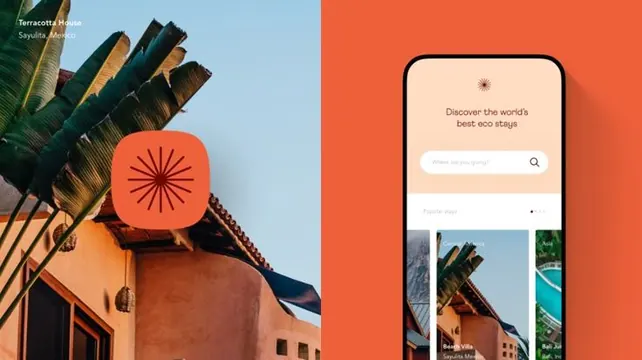
Split-screen layout pairing textured travel photography with a search-focused mobile app mockup in warm terracotta and beige.
Summary
Split-screen layout pairing textured travel photography with a search-focused mobile app mockup in warm terracotta and beige.
Visual description
Left half shows vernacular architecture (terracotta-hued building with vegetation) and tall palm fronds with text overlay "Terracotta Seville Seville Mexico"; right half displays a mobile UI with burnt-orange background, centered search input ("Where are you going?"), tagline "Discover the world's best eco stays" in serif font, and three thumbnail cards below showing travel destinations. The entire composition balances organic photography texture against clean, minimal UI elements using a cohesive warm color story of orange, beige, muted green, and white.
Key takeaway
The split-screen balance between photographic authenticity and functional app design; using warm terracottas and beiges to unify disparate visual styles; centered search with descriptive tagline as the UI's anchor point.
Reuse notes
Strong reference for travel or hospitality tech apps seeking to combine lifestyle imagery with functional design. The warm palette and organic asymmetry feel inviting without sacrificing clarity. Works well for eco-tourism or boutique travel platforms.
More like this


Keep what you find
A free account saves references to boards and can send you a weekly email of picks based on what you save.
To see every result, go Pro.