Preview image. Unlock full-res
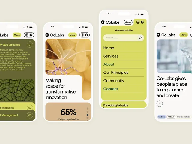
Mobile collaborative platform with bright yellow accent color, soft imagery, step-by-step guidance cards, and sustainability statistics in a modular card layout.
Summary
Collaborative research platform UI showcasing soft step-by-step guidance cards and a lime-yellow primary color anchoring a light, nature-inspired visual system for scientific workspaces.
Visual description
Four vertical mobile screens display a cohesive app system. Left screen shows a greenish-brown sidebar with numbered step labels (01, 02, 03) and body copy about project execution and management, paired with a photographic leaf vein detail at the bottom. Center-left screen features a heroic full-bleed nature image of hands working with soil and small blue crystals, overlaid with a white rounded container holding a large "65%" statistic and supporting text. Center-right screen uses a solid lime-yellow background with a clean white rounded search bar, followed by stacked menu items (Home, Services, About, Our Principles, Community, Contact) in dark text with horizontal dividers, capped by a yellow button prompting action. Right screen shows a white photograph and body copy describing CoLabs' mission, with pill-shaped tags at the bottom in white, blue, and gray. All screens share a rounded corner aesthetic, consistent sans-serif headlines in black, and unified navigation with Menu button and social icons.
Key takeaway
The soft, scientific aesthetic built on contrast between earthy photography and pure lime-yellow UI elements rather than aggressive contrast. The step-numbered card progression for complex onboarding without feeling sterile. The combination of modular card containers with full-bleed hero imagery balances structure and breathing room.
Reuse notes
Effective for educational, scientific, nonprofit, or collaborative-workspace products targeting a professional yet approachable audience. Works especially well when the product involves multi-step processes or community participation. The yellow-on-light palette works on smaller screens but ensure contrast ratios meet AA minimum for text accessibility.
More like this





Keep what you find
A free account saves references to boards and can send you a weekly email of picks based on what you save.
To see every result, go Pro.