Preview image. Unlock full-res
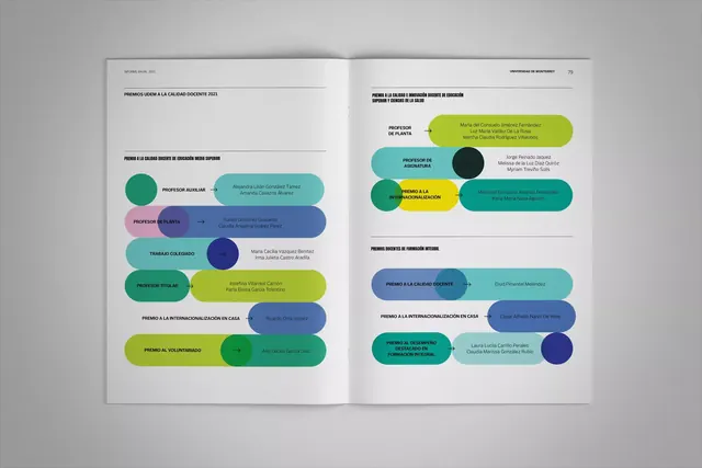
Two-page magazine spread using bright, rounded color blocks as containers for institutional or award information, creating visual rhythm through teal, lime, purple, and pink accents.
Summary
A two-page editorial layout organizing multiple awards or achievements into bright, rounded color-block containers stacked vertically, using teal, lime, purple, and pink to code distinct categories or award types.
Visual description
Spread photographed on neutral gray backdrop. Left and right pages mirror a modular design: vertical stacks of overlapping rounded-corner blocks in teal, lime green, purple, and hot pink, each block containing small title text and descriptive copy. Circular accent dots (navy, teal, dark green) punctuate the layout. Clean white background with generous breathing room between blocks. All text in crisp sans-serif, black on light, hierarchical but minimal. Composition emphasizes the colored containers over text, creating a rhythmic color sequence down the page.
Key takeaway
The use of bright, saturated color blocks as information anchors instead of traditional boxes or borders, and the overlapping circular accents that add dimensionality without clutter. The vertical stacking creates a scannable achievement timeline.
Reuse notes
Strong for institution or nonprofit reports, award listings, and event schedules where color-coding multiple items aids navigation. Works well at magazine or publication scale. Scale down or increase block size depending on the amount of supporting text needed.
More like this


Keep what you find
A free account saves references to boards and can send you a weekly email of picks based on what you save.
To see every result, go Pro.