Preview image. Unlock full-res
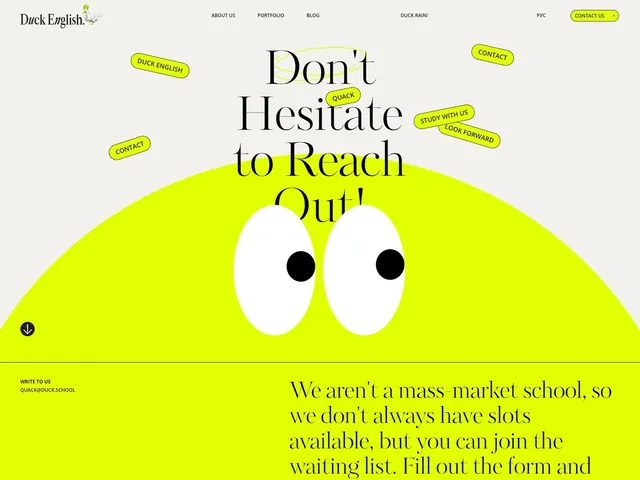
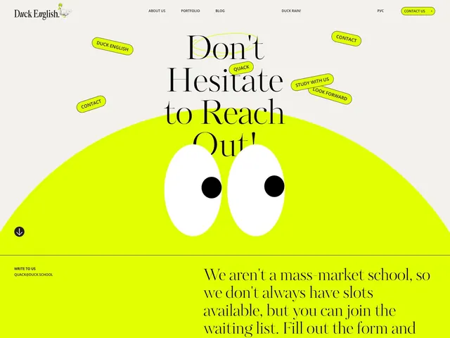
Language school homepage with neon-yellow wavy shape, oversized serif headline, mascot eyes illustration, and scattered yellow callout badges anchoring the value prop.
Summary
Language school hero combining a neon-yellow organic shape with playful scattered text badges (Contact, Study With Us, Quack) that decentralize the message and invite interaction.
Visual description
A cream-beige background with a large, soft-edged yellow wavy shape dominating the lower two-thirds. Inside the shape sit two large, simple white oval eyes with black pupils, evoking a duck mascot. Above, overlaid black serif text reads "Don't Hesitate to Reach Out" in an oversized, statementlike display typeface. Yellow rounded-pill badges with black text scatter across the composition (upper left, upper right, center) labeling actions (Contact, Study With Us, Quack, Duck English, Look Forward). The navbar is minimal (About Us, Portfolio, Blog, Duck Rain, PVC, Contact button) in black serif type on cream. At the bottom, a yellow band holds italicized body copy in serif explaining the school's boutique positioning, with email contact details.
Key takeaway
Scattered label badges break rigid hierarchy and humanize a formal message. The single organic curved shape housing the character avoids rectangles entirely. Mixing serif and sans-serif (serif for personality, sans for clarity) balances warmth with legibility.
Reuse notes
Strong for education (language schools, tutoring) where approachability matters more than corporate polish. Relies on a clear mascot or character to justify the playful badge scatter; use when the brand has personality. The large eyes create an instant emotional anchor, especially effective for school/learning-focused sites.
More like this



Keep what you find
A free account saves references to boards and can send you a weekly email of picks based on what you save.
To see every result, go Pro.