Preview image. Unlock full-res
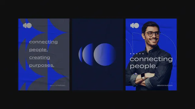
Three vertical panels in navy-to-bright-blue gradient, the left and center featuring geometric circles and abstract type, the right showing a portrait photo, unified by oversized sans-serif copy about connection and vision.
Summary
A horizontal triptych using a dark-to-bright blue gradient, blending two abstract geometric panels with one portrait, unified by enormous sans-serif headlines declaring a vision of "connecting people, creating purpose."
Visual description
Three equal-width vertical sections are aligned horizontally. The leftmost panel is dark navy, overlaid with light-colored sans-serif text (lowercase, compact) stacked vertically ("connecting people, creating purpose") and abstract geometric circles in bright blue. The center panel shows large, overlapping circles of varying blues and opacity, creating depth through layering and creating a soft gradient. The right panel features a portrait photograph of a professional against the blue gradient, with additional oversized white display type reading part of the headline ("connecting people, creating purpose"). All panels share the same blue-gradient fill, creating a seamless visual flow. A small circular logo mark is centered in the top area, repeated across the composition to anchor brand identity.
Key takeaway
The triptych format allows conceptual sequencing (abstraction, abstraction, reality) while maintaining visual unity through color and type. Large overlapping circles create dynamic depth without relying on photorealism. Breaking headlines across panels and using opacity variation on text and shape lets you layer meaning (concept, process, outcome). The consistent gradient anchors the entire composition despite the varied content of each panel.
Reuse notes
Ideal for technology, consulting, networking, or purpose-driven B2B brands. The abstract-to-portrait journey suggests movement from concept to human impact. Best suited for hero or a primary feature section. The bright-blue gradient can be recolored to match brand palette; the geometric circles adapt well to different color schemes. Works on desktop; consider a stacked mobile layout. The oversized type only works if your headline is short and punchy.
More like this



Keep what you find
A free account saves references to boards and can send you a weekly email of picks based on what you save.
To see every result, go Pro.