Preview image. Unlock full-res
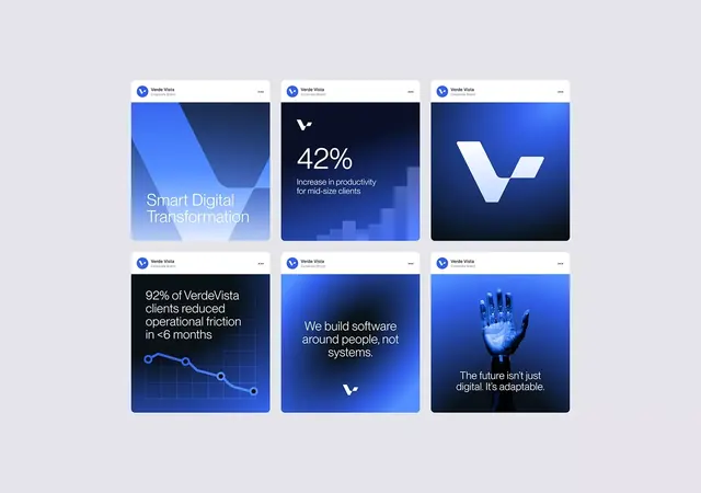
A 3x2 grid of branded cards showcasing digital transformation messaging with layered blue gradients, abstract shapes, and supporting statistics.
Summary
A 3x2 grid of branded cards showcasing digital transformation messaging with layered blue gradients, abstract shapes, and supporting statistics.
Visual description
Six rounded cards arranged in a 3x2 grid, each topped with the VerdeVista brand mark and menu icon. The cards alternate between several distinct treatments: wavy abstract geometric shapes in layered blues (top-left, top-right, and bottom-right); large white percentage figures with brief supporting copy against dark-blue-gradient backgrounds (top-center); a bold white logotype floating on near-black (top-right); and a blue line graph with nodes on a dark gradient (bottom-left). All cards use a cool blue palette ranging from royal blue to navy to light periwinkle, with white or light text. Sans-serif typography is clean and hierarchical throughout.
Key takeaway
Asymmetric card treatments within a uniform grid structure create visual rhythm without requiring identical layouts. Layered blue gradients and geometric abstraction convey technical sophistication. Mixing data (metrics and charts) with conceptual imagery (shapes, logos) gives the system flexibility for varied messaging.
Reuse notes
Ideal for B2B SaaS or tech consulting landing pages, pitch decks, or brand asset libraries. The gradient layering works best on dark backgrounds to avoid mud; the white text is sufficiently high-contrast. Reserve this system for professional, data-focused narratives.
More like this



Keep what you find
A free account saves references to boards and can send you a weekly email of picks based on what you save.
To see every result, go Pro.