Preview image. Unlock full-res
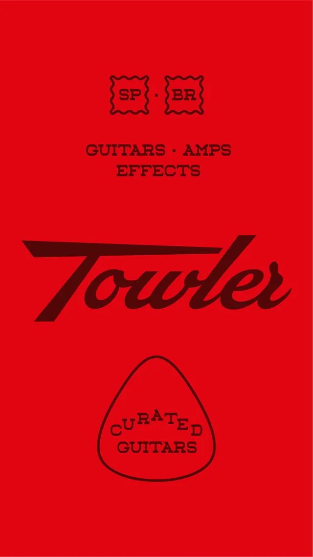
A bold, high-contrast red brand identity featuring a stylized wordmark and geometric logos for a guitar equipment company.
Summary
A bold, high-contrast red brand identity featuring a stylized wordmark and geometric logos for a guitar equipment company.
Visual description
A solid red background features a large, italicized black serif wordmark for 'Touler'. Above it are two small boxed logos with 'TP' and 'TGE' initials, and below it is a large, rounded triangular logo containing 'CURATED GUITARS'.
Key takeaway
The design uses heavy contrast and expressive typography to create a strong, authoritative brand presence.
Reuse notes
Use the high-contrast red and black color palette for promotional materials and product packaging.
More like this





Keep what you find
A free account saves references to boards and can send you a weekly email of picks based on what you save.
To see every result, go Pro.