Preview image. Unlock full-res
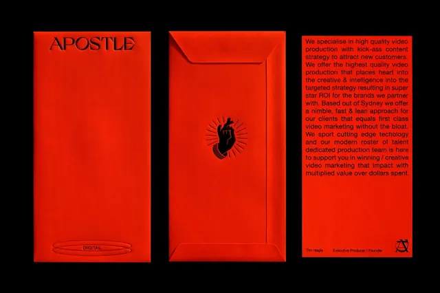
A bold three-panel composition in fire-engine red with the brand name APOSTLE DIGITAL on the left, a stylized envelope icon in the center, and service copy on the right, all set against black negative space.
Summary
A bold three-panel composition in fire-engine red with the brand name APOSTLE DIGITAL on the left, a stylized envelope icon in the center, and service copy on the right, all set against black negative space.
Visual description
Three vertical red rectangles sit side by side against a black background. The leftmost panel displays "APOSTLE" in all-caps serif at the top, "DIGITAL" in smaller sans-serif at the bottom, and a decorative rounded oval frame below that. The center panel features a stylized black envelope icon with a subtle 3D embossed effect and radiating lines suggesting motion or urgency, centered on a seamless red ground. The right panel holds justified body copy in small black sans-serif describing the brand's video production and content strategy services ("We specialise in high quality video production with kick-ass content strategy..."). A small logo mark and credit line appear in the bottom-right corner. The fire-engine red (bright, saturated, with slight shade variations in the background) dominates, creating maximum contrast and visual impact against the black void.
Key takeaway
The monochromatic red-and-black palette is fearless and instantly memorable; the three-panel structure lets each element (brand name, icon symbol, and story copy) breathe independently while remaining visually bound. Using an envelope as the central symbol is unexpected and clever for a communications/creative firm. The mix of serif (brand) and sans-serif (supporting) adds hierarchy without visual noise. High contrast and large scale demand attention without relying on color complexity.
Reuse notes
Ideal for creative agencies, video production, or media brands that need to project confidence and boldness. The red is particularly effective in portfolios, pitch decks, and business cards where memorability matters. The three-panel format works for any triptych narrative (brand name, symbol, story) or can be adapted to two panels. Works best on dark backgrounds or as a self-contained composition; the intensity and warmth of the red may overwhelm softer color contexts. The envelope is brand-specific; substitute with your own icon (camera, film reel, light bulb, etc.) to maintain the same graphic rhythm.
More like this






Keep what you find
A free account saves references to boards and can send you a weekly email of picks based on what you save.
To see every result, go Pro.