Preview image. Unlock full-res
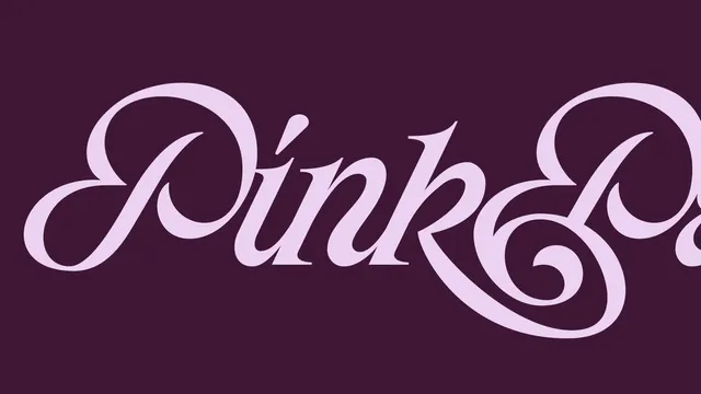
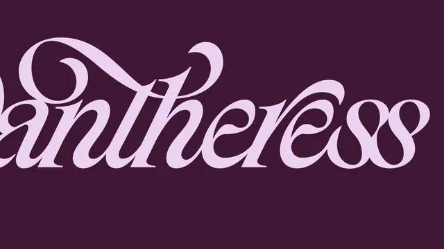
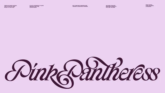
Three typographic explorations of custom lettering designs with flowing, decorative serifs in pink, blue, and purple color variations against dark and light backgrounds.

Summary
A three-slide carousel of custom serif lettering rendered in different colors: two slides feature pink/lavender letterforms on dark purple backgrounds (one stacked, one more spread), and a third slide explores the same letters on a soft pink background with ornate serif and flourish details.
Visual description
Slide 1: Pink decorative serif letterforms arranged vertically with flowing, exaggerated terminals and swashes against a dark purple background. Letters appear to read as stylized text with intricate serif details. Slide 2: A more compact horizontal arrangement of similar pink letterforms on the same dark background, with thicker stroke weight and different letter spacing. Slide 3: Lighter pastel pink background with dark purple letterforms, showing the same lettering style with additional ornamental text and design notes scattered at the top in small sans-serif type.
Key takeaway
Exploring serif variation and customization through multiple color and composition trials. The flowing, decorative serif style is the consistent design element across all three versions, demonstrating how the same form reads differently with color flips and spatial arrangement changes.
Reuse notes
Excellent reference for custom serif letterforms and calligraphic flourishes. Useful for branding, luxury design, and decorative typography work. The pink-on-dark and dark-on-light color combinations show effective contrast strategies. Best for ornamental or display contexts rather than body text.
From this post: Custom lettering style studies in pink and purple
View post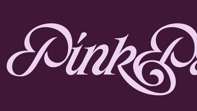
More like this
Keep what you find
A free account saves references to boards and can send you a weekly email of picks based on what you save.
To see every result, go Pro.