Preview image. Unlock full-res
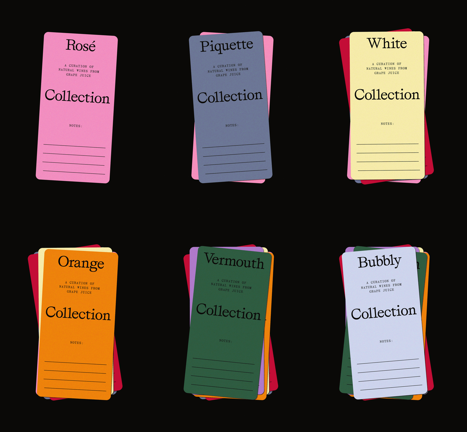
Bright pink rounded card on black background with serif and monospace typography announcing a curated natural wine collection.
Summary
A hot pink card with rounded corners mounted on black, using serif, monospace, and sans-serif typefaces to present a wine collection brand and product description.
Visual description
Center-aligned card in vibrant pink (#ED800C adjacent warm tone) against pure black background. Hierarchy progresses: large serif word "Rosé" at top; smaller monospace line "A curation of" followed by "NATURAL WINES FROM GRAPE JUICE" in all-caps monospace across three lines; prominent sans-serif word "Collection" in large, modern weight centered beneath; "NOTES:" in monospace at lower-left; four hand-writable lines below in thin ink. Typography mixes three distinct faces with no decoration, relying on scale and weight shifts to organize content. The card is portrait-oriented, approximately 2:1 height-to-width ratio, with 2-3cm padding from edge, and a subtle drop shadow grounds it against the black field.
Key takeaway
The confident palette restriction: pink and black only, no brown, no gold, no detail. The multi-font system (serif for brand, monospace for description, sans for product category) works because the type sizes and weights do the hierarchy work, not competing personalities. The inclusion of blank note lines transforms the card from display to object, inviting hand-written engagement.
Reuse notes
Strong template for premium beverage, natural product, and artisanal goods branding. The aesthetic reads contemporary and editorial while feeling handmade. Works particularly well for wines, spirits, small-batch foods, and design-forward retail. The pink-and-black contrast is high-impact in digital mockups and in-person. Pair with sans-serif body copy and generous whitespace in layouts to echo the card's restraint.
More like this




Keep what you find
A free account saves references to boards and can send you a weekly email of picks based on what you save.
To see every result, go Pro.