Preview image. Unlock full-res
Video specimen of II Balfron, an all-caps single-weight typeface built on a strict structural grid, with sharp angles reflecting the geometry of the Balfron Tower concrete profile.

Summary
A video specimen showcasing II Balfron, a typeface inspired by Goldfinger's iconic Balfron Tower in East London. The type features sharp angles, strict structural geometry, and a single bold weight designed to command attention at large scales.
Visual description
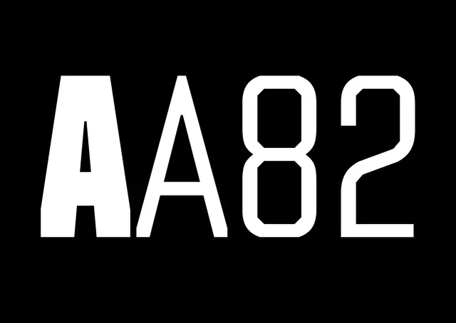
Bright cyan background with large black letters spelling out the typeface name. Small text at top left indicates "1482pt" and "Regular" weight. The letterforms are imposingly tall, with sharp angles and precise geometric construction. Thin white negative space cuts through the black letters, creating dramatic contrast and emphasis. The specimen frame shows the bold, commanding presence of the typeface, demonstrating how it comes alive when scaled up. The video (evident from context) animates this display, likely showcasing the typeface in motion or at varying scales.
Key takeaway
Type that is inseparable from its architectural inspiration. The sharp angles and structural rigor feel authentic to the brutalist reference rather than merely decorative. Best appreciated at display sizes where the geometric precision becomes visible and impactful.
Reuse notes
Ideal for architecture-related projects, brutalist or modernist design systems, and editorial work needing bold, authoritative headlines. The single-weight approach simplifies implementation while the geometric sharpness ensures distinctiveness. Strong for branding projects with technical or institutional positioning. Works best in monochrome or high-contrast color schemes.
More like this

Keep what you find
A free account saves references to boards and can send you a weekly email of picks based on what you save.
To see every result, go Pro.