Preview image. Unlock full-res
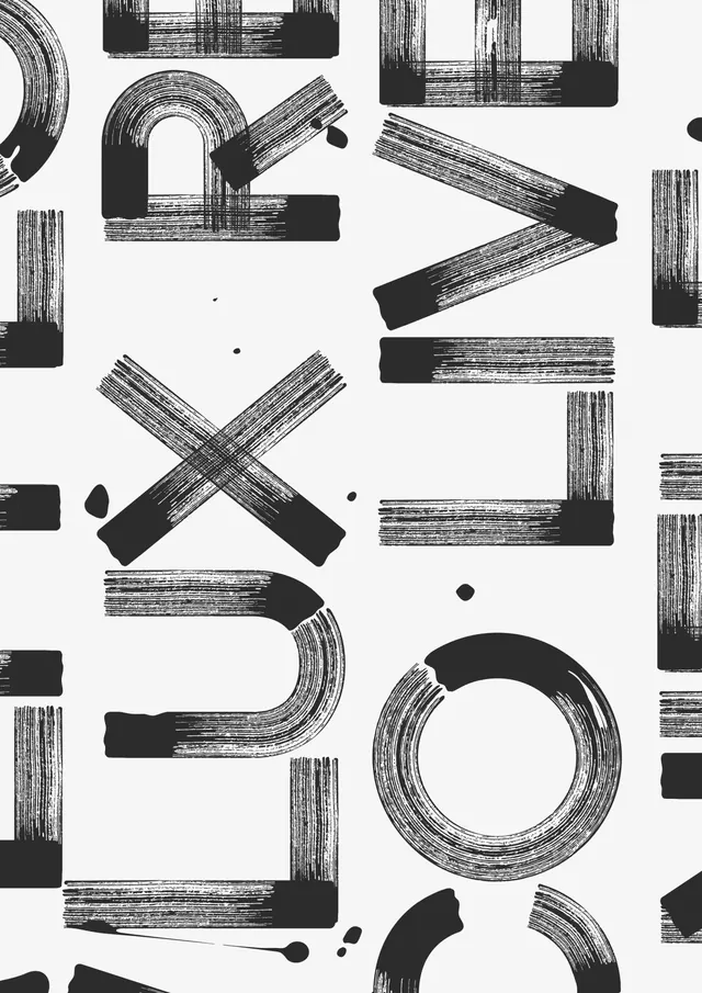
Black and white abstract composition using hand-drawn typographic forms—arcs, angles, rectangles—arranged playfully with scattered dots on a light background.
Summary
An experimental monochrome composition built from hand-drawn letterforms and geometric shapes—curved arcs, angled strokes, rectangles—scattered across a white field with small solid dots. Each element has visible line texture suggesting ink or marker.
Visual description
White background filled with black hand-drawn forms: curved U-shapes and O's with hatched line fill, angular brackets and chevrons, solid rectangles and small squares, all arranged without obvious grid. Small black dots punctuate the composition. Line work is rough and gestural, with visible pen/marker texture. The forms suggest partial or deconstructed letters but avoid literal reading, creating visual rhythm through repetition and variation.
Key takeaway
Breaking letterforms into playful, modular components—and combining them with non-alphabetic shapes—creates an energetic, exploratory visual language that feels more like mark-making than traditional typography.
Reuse notes
Strong reference for experimental type design, poster work, or branding that embraces imperfection and hand-drawn character. Works well for creative agencies, design studios, or concepts exploring the intersection of drawing and lettering.
More like this
Keep what you find
A free account saves references to boards and can send you a weekly email of picks based on what you save.
To see every result, go Pro.