Preview image. Unlock full-res
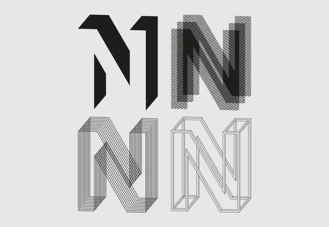
Four variations of the letter N with different line and 3D rendering techniques—solid, hatched, line-art, and isometric outline.
Summary
A typographic exploration showing four versions of the letter N rendered in increasingly complex ways: solid black, hatched/patterned, thin line-art, and geometric isometric outline.
Visual description
Top left: solid bold N in black. Top right: N with horizontal line-hatching creating depth. Bottom left: N rendered in thin outline with concentric lines suggesting 3D form. Bottom right: N in isometric wireframe perspective. All are roughly the same scale on a light gray background. No color variation; monochromatic study.
Key takeaway
Single-glyph explorations reveal how treatment—fill, pattern, lineweight, and perspective—can transform visual impact and complexity while maintaining a core form.
Reuse notes
Excellent for exhibition design, printed type specimens, or architectural/spatial design contexts. The progression from solid to complex is pedagogical; useful for showing design thinking or iteration.
More like this


Keep what you find
A free account saves references to boards and can send you a weekly email of picks based on what you save.
To see every result, go Pro.