Preview image. Unlock full-res
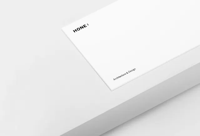
A minimalist white design document or publication cover for a project called "Hone" with minimal typography treatment.
Summary
A minimalist publication cover or identity document in nearly all white, with sparse typography reading "HONE:" and "Architecture & Design" in small sans-serif type.
Visual description
A nearly monochromatic white surface with extremely restrained typography. The main text "HONE:" appears in uppercase sans-serif at an angle in the upper portion, and smaller text reading "Architecture & Design" sits below it. The entire composition is rendered in off-white and gray tones with subtle shadows suggesting depth. The design exemplifies restraint and the Swiss style approach to information hierarchy.
Key takeaway
Extreme minimalism and whitespace can communicate sophistication and professionalism. The careful placement of minimal typography creates emphasis through absence rather than decoration.
Reuse notes
Excellent reference for architecture, design, or technology brands targeting a professional audience. The near-white palette conveys premium positioning and elegance. Works particularly well for identity systems, annual reports, or high-end publication design. The angled text treatment adds subtle dynamic to an otherwise austere layout.
More like this



Keep what you find
A free account saves references to boards and can send you a weekly email of picks based on what you save.
To see every result, go Pro.