Preview image. Unlock full-res
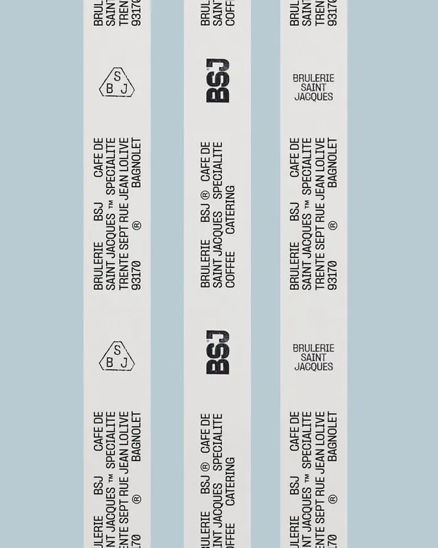
Minimal café branding system with three logo variations (geometric monogram, bold letterform, text-only) shown on stacked business cards in muted neutral tones.
Summary
Minimal café branding system with three logo variations shown on stacked business cards in muted neutral tones.
Visual description
Three vertical business cards are fanned to show depth, each in off-white or light grey stock. The leftmost card displays a geometric hexagon monogram with the initials "SBJ" in a thin line style. The center card shows a bold, condensed letterform "BSJ" in black sans-serif, modern and dense. The rightmost card features the full business name "Brulerie Saint Jacques" in small caps. All three cards carry identical contact and café information in tight, left-aligned type at the bottom. The layout is symmetrical, with consistent white space and a soft, professional color story dominated by warm greys and cool light tones.
Key takeaway
The minimal logo system demonstrates how three distinct mark styles (geometric, typographic, and text-only) can coexist in one identity without redundancy. The stacked-card presentation effectively shows brand application and allows each treatment to breathe while remaining cohesive.
Reuse notes
Strong reference for minimal food/beverage branding, French or European aesthetic contexts, and any work requiring a multi-faceted logo system that scales from mark to text. The neutral palette works well with spot color or photographic backgrounds.
More like this




Keep what you find
A free account saves references to boards and can send you a weekly email of picks based on what you save.
To see every result, go Pro.