Preview image. Unlock full-res
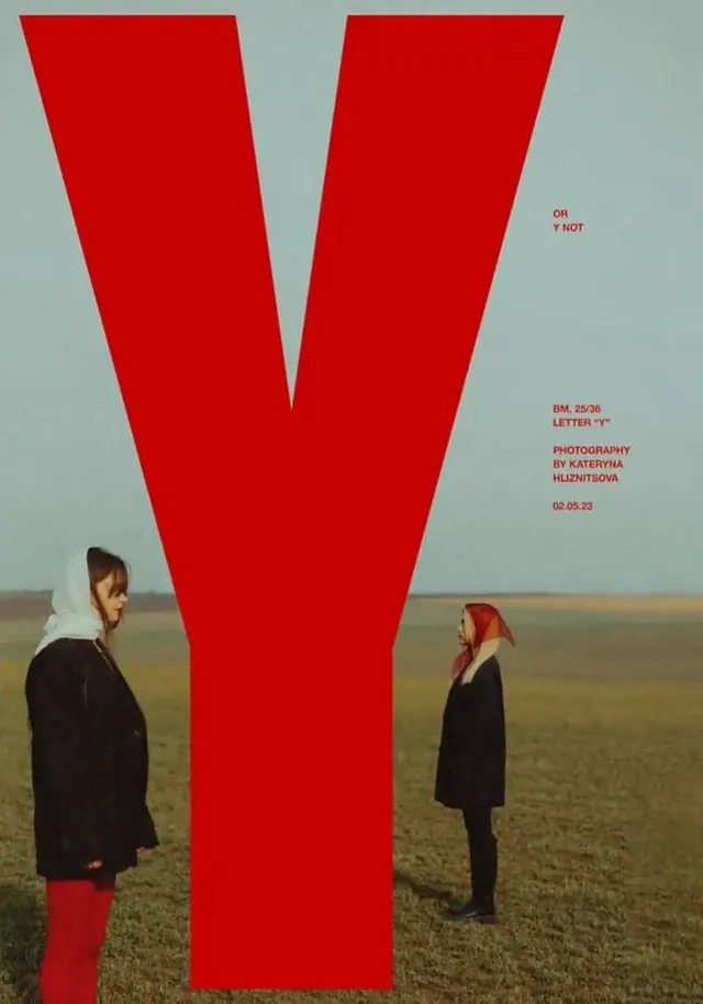
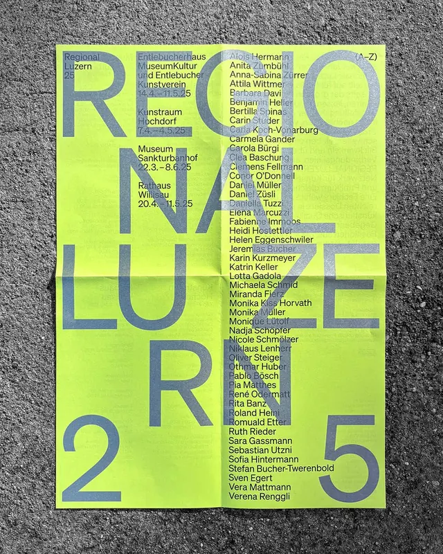
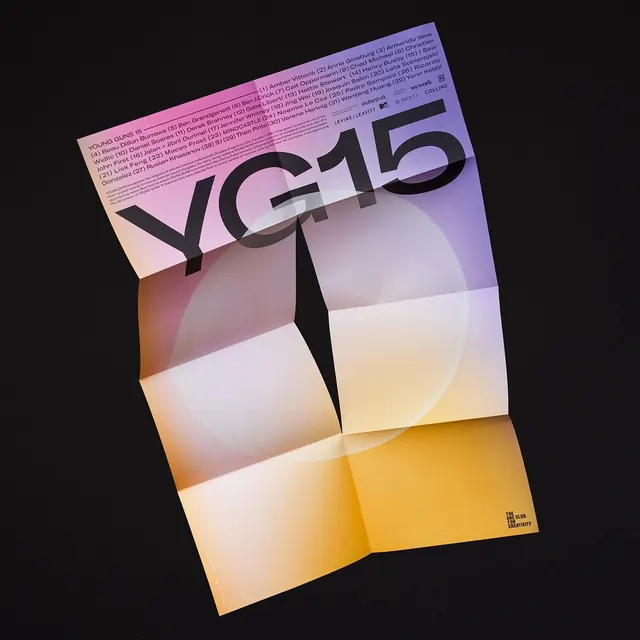
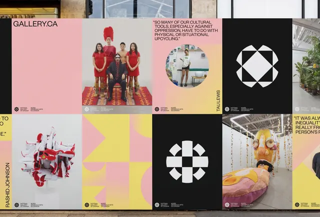
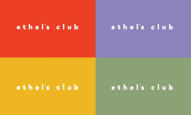
A graphic design composition by Annika Hansteen for Izora featuring a sophisticated multi-color palette with purple, green, red, and gold.
Summary
A graphic design study by Annika Hansteen for Izora, showcasing a sophisticated palette combining purple, sage green, vibrant red, and warm gold.
Visual description
A horizontal composition balancing multiple colors: a cool purple tone, muted sage green, vibrant red-orange, and warm golden yellow. The colors are arranged with intention, likely supporting typography or graphic elements. The composition is confident and editorial in character, suggesting magazine or brand identity work.
Key takeaway
A multi-color palette works when colors are carefully weighted and harmonized. The mix of cool (purple, green) and warm (red, gold) tones creates dynamic balance and visual interest.
Reuse notes
Strong reference for editorial, cultural, or modern brand identities. The color combination is sophisticated and memorable. Works well when paired with clear typography and generous spacing. Excellent for publications, cultural organizations, or brands wanting personality with authority.