Preview image. Unlock full-res
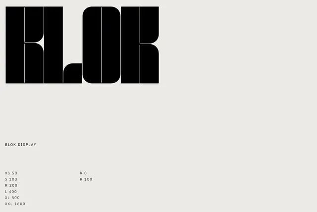
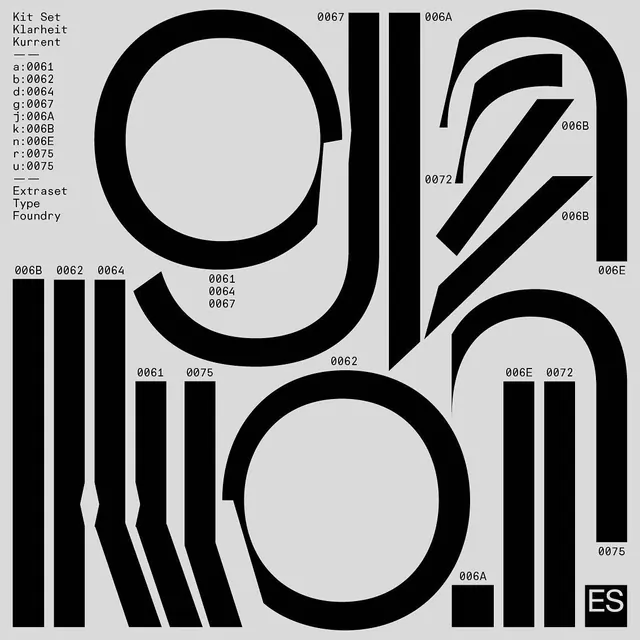
Type specimen showcasing Blok, a geometric sans-serif typeface, with clean layout demonstrating character set and weights.
Summary
A minimalist type specimen for a geometric sans-serif typeface showing character sets, weights, and functionality in a clean Swiss-style grid layout with black type on off-white background.
Visual description
Cream or off-white background with black sans-serif type organized in a logical grid. Large alphabet samples demonstrate the typeface's clean, geometric proportions. Smaller examples show numbers, punctuation, and extended character sets. Multiple weights (likely Light, Regular, Bold, Black) are displayed side by side for comparison. Text is tightly typeset with strong left alignment. No decorative elements or images; purely typographic. Layout uses horizontal and vertical structure creating clear hierarchy through scale and weight rather than color or spacing.
Key takeaway
Specimen clarity through constraint. Showing a typeface's versatility within a monochromatic, grid-based layout forces the type itself to be the story. No supporting imagery needed; the characters do the work. This is how to document a type system thoroughly.
Reuse notes
Essential reference for designing type specimens. Study the scale progression and how each sample answers a specific question: "What does it look like at display size? At body text size? How do the weights compare?" Good for documenting your own typefaces or building type-focused marketing. The grid structure feels Swiss and professional—replicable for tech-focused brands that need type to communicate confidence.
More like this

Keep what you find
A free account saves references to boards and can send you a weekly email of picks based on what you save.
To see every result, go Pro.