
Preview image. Unlock full-res
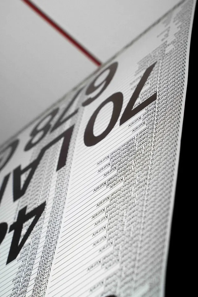
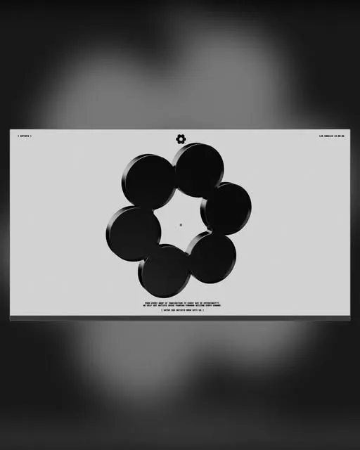
A vertical typographic composition featuring type specimens and design references in a clean, minimal layout with subtle gradient or tonal variations.
Summary
A clean, vertically-oriented type specimen showcasing multiple typeface variations in a minimalist editorial layout with strong typographic hierarchy and generous whitespace.
Visual description
Tall, narrow vertical composition filled primarily with type samples arranged in a grid or structured layout. The palette is strictly two-tone with light gray dominating and near-black text creating stark contrast. Multiple type treatments are visible—serif, sans-serif, and mixed combinations—suggesting a comprehensive type specimen or design reference guide. The layout demonstrates careful hierarchy with size variations creating visual organization. Whitespace is generous and intentional, creating a sense of calm and clarity. The composition appears to be documentation of typography itself, with minimal secondary information and maximum focus on letterforms.
Key takeaway
The effectiveness of pure typography as visual design when supported by thoughtful hierarchy and generous spacing. Type specimens don't need decoration or imagery—rigorous layout and contrast are sufficient. The vertical aspect ratio perfectly suits the reading and scanning of type samples.
Reuse notes
Perfect reference for type specimen publications, design documentation, or editorial layouts that celebrate typography. The vertical format works well for digital presentations, scrolling experiences, or printed broadsheets. The minimalist approach is ideal for design-focused audiences and professional contexts where restraint demonstrates expertise. Strong reference for design systems documentation.
More like this

Keep what you find
A free account saves references to boards and can send you a weekly email of picks based on what you save.
To see every result, go Pro.