Preview image. Unlock full-res
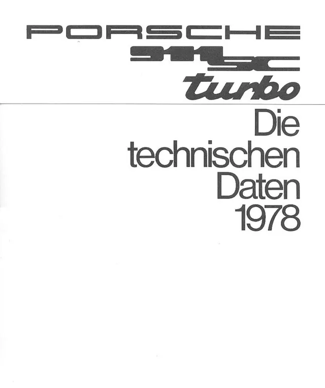
Vintage black-on-white brochure cover pairing retro automotive logotypes with a right-aligned grotesque headline reading Die technischen Daten 1978.
Summary
A scanned 1970s car brochure cover: three model logotypes stacked at top, a thin horizontal rule, and the German headline "Die technischen Daten 1978" set right-aligned, all in dark gray on off-white.
Visual description
The top band carries the marque's wide striped display logotype, the model designation "911 SC" in the same slotted retro letterforms beneath it, and a lowercase italic "turbo" script-style wordmark, each stepped progressively rightward. A hairline rule spans the full width and separates this lockup from the body. Below, "Die technischen Daten 1978" is set in a large light grotesque across four right-ragged lines pushed to the right margin. The lower half of the page is empty white space; paper texture and soft scan shadows are visible at the edges.
Key takeaway
Three distinct logotype styles coexist because they share one color and a stepped alignment; the oversized empty lower half gives a technical document unexpected poise. The single hairline rule does all the structural work.
Reuse notes
Reference for spec-sheet covers, retro automotive or engineering-flavored editorial, and typographic hero layouts that lead with stacked wordmarks. The right-aligned ragged headline plus vast bottom whitespace is easy to lift into posters or PDF covers. Period letterforms are the charm; substituting a generic sans loses most of it.
More like this



Keep what you find
A free account saves references to boards and can send you a weekly email of picks based on what you save.
To see every result, go Pro.