Preview image. Unlock full-res
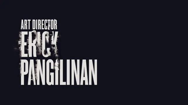
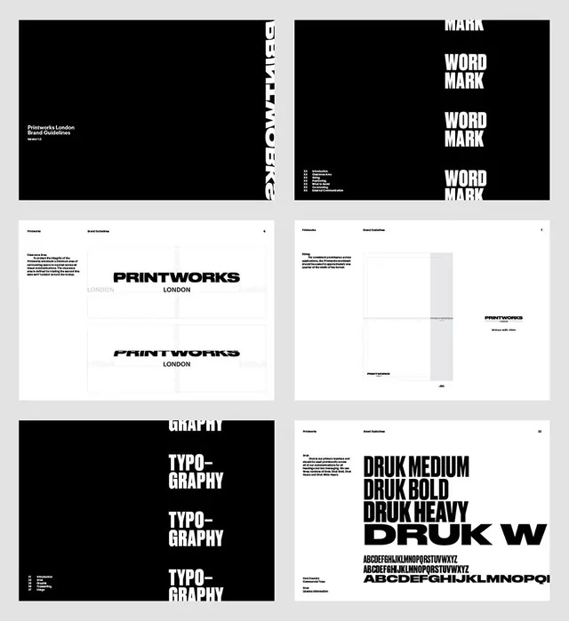
Widescreen title sequence design with high contrast between dark charcoal and light off-white; dramatic typographic motion design reference.
Summary
A professional title sequence design with stark monochromatic contrast; bold typographic composition in widescreen format suitable for film or game media.
Visual description
Widescreen rectangular format with extreme contrast between very dark charcoal/near-black and very light off-white tones. Bold, sans-serif typography dominates the composition. The design is clean and technical, with precise typography placement. The high contrast creates drama and visual impact.
Key takeaway
High-contrast monochromatic design creates drama and sophistication; particularly effective in motion or title sequence contexts. Bold, large-scale typography can carry an entire design when supported by strong contrast. The widescreen format aligns with cinematic or game-focused design contexts.
Reuse notes
Excellent for title sequences, opening credits, or motion design projects. Works well for dramatic, bold, or technical brand identities. The high contrast makes it suitable for film, game, or streaming media contexts. Pairs well with similar bold, dramatic design approaches. The monochromatic palette is timeless and sophisticated.
More like this


Keep what you find
A free account saves references to boards and can send you a weekly email of picks based on what you save.
To see every result, go Pro.