Preview image. Unlock full-res
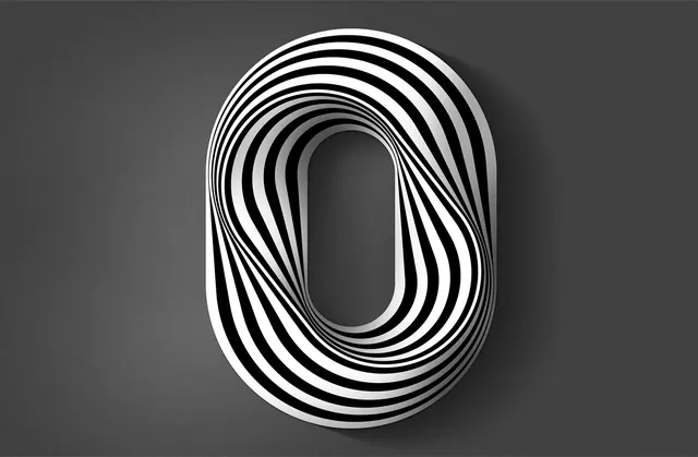
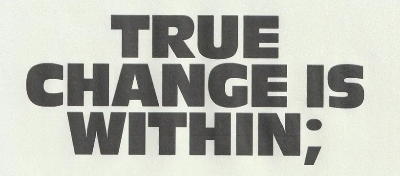
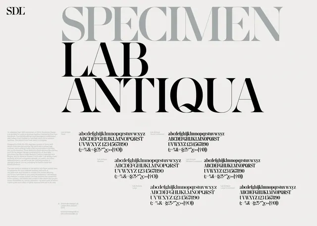
A typographic or graphic design piece from the 36 Days of Type 2017 project on Behance, featuring dark and light tones.
Summary
A typographic design from the 36 Days of Type 2017 challenge on Behance, showcasing letter or character design in a landscape format (1400x917 pixels) with dark gray and light gray tones.
Visual description
The image presents a typographic or letter-based design composition at 1400x917 pixels in landscape orientation. The palette is restricted to grayscale tones: dark gray (#404040) dominates at ~75% of the composition, while light gray (#E3E3E3) provides contrast and emphasis. The aspect ratio (0.655 width-to-height) suggests a wide, horizontal layout ideal for display typography or letter-form studies.
Key takeaway
The 36 Days of Type project is a globally recognized typographic challenge emphasizing creative letter design and character exploration. This entry represents careful typographic or graphic thinking within a structured creative constraint.
Reuse notes
Valuable reference for typographic design, letter-form studies, and monochromatic design systems. Useful for understanding how constraint-based design projects (like 36 Days of Type) produce innovative work. Works well for contemporary typeface design, poster concepts, or editorial typography research.
More like this

Keep what you find
A free account saves references to boards and can send you a weekly email of picks based on what you save.
To see every result, go Pro.