Preview image. Unlock full-res
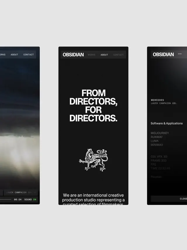
Minimalist dark portfolio site for a creative film-production studio, centered on a bold white headline and heraldic mark.
Summary
A dark hero page for a creative film studio, combining bold sans-serif typography with a minimalist heraldic dragon icon and high contrast monochrome palette.
Visual description
Jet-black full-height layout with white sans-serif display type reading "FROM / DIRECTORS, / FOR DIRECTORS." Centered below the headline is a white line-drawn dragon emblem, symmetrical and heraldic in style. Navigation sits top: "OBSIDIAN" wordmark (upper-left) with a sparse menu (WORKS, ABOUT, CONTACT). Below the fold, small sans-serif copy ("We are an international creative production studio representing a curated selection of filmmakers") in light gray hints at the studio's scope. Silent video or film-grain texture visible in far-left and right panels. Negative space dominates.
Key takeaway
The dragon emblem: a memorable, scalable mark that lifts the design from generic. The ratio of negative space to typography creates anticipation. The line-drawn icon in white-on-black reads crisp at any size and pairs naturally with film/motion work. Spare navigation doesn't distract from the bold positioning.
Reuse notes
Perfect for film, creative studios, luxury brands, or design agencies wanting to project seriousness. The dark mode + heraldry pair well with high-end, curation-focused positioning. Requires strong motion/video assets to justify the empty space. Would feel cold without genuine craft behind it; avoid if the studio's work cannot land the premium positioning.
More like this


Keep what you find
A free account saves references to boards and can send you a weekly email of picks based on what you save.
To see every result, go Pro.