Preview image. Unlock full-res
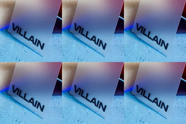
A repeating pattern of cards bearing "VILLAIN" text displayed on a blue-to-pink gradient surface with textured, dimensional elements.
Summary
A branded composition showing multiple cards with "VILLAIN" wordmark repeated across a gradient background that transitions from cool blue through pink, creating a dynamic tiled pattern.
Visual description
Six identical cards arranged in a 2x3 grid, each bearing "VILLAIN" in bold sans-serif type against a gradient that shifts from blue on the left to warm pink on the right. The cards appear slightly offset and three-dimensional, with textured surfaces catching light unevenly.
Key takeaway
Using gradient backgrounds to unify a repetitive pattern—the directional color shift across the layout creates visual flow and energy even within a minimal grid structure.
Reuse notes
Strong approach for bold brand campaigns, packaging proofs, or product-showcase compositions. The gradient-on-repeat pattern works well at multiple scales. Consider using for edgy, modern brands targeting creative or tech audiences.
More like this





Keep what you find
A free account saves references to boards and can send you a weekly email of picks based on what you save.
To see every result, go Pro.