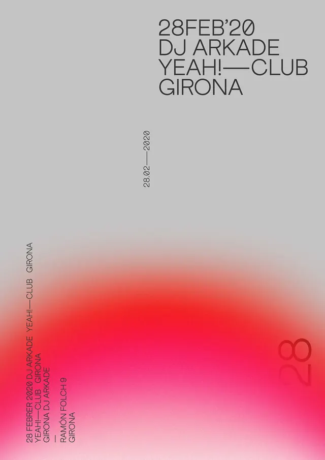
Preview image. Unlock full-res
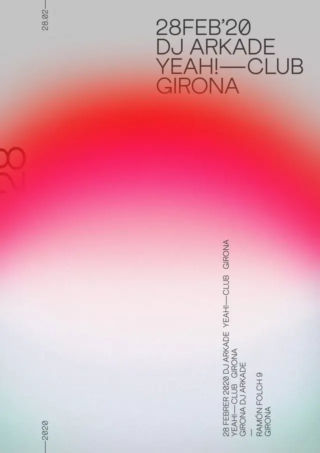
A tall event poster composition using a subtle gradient transitioning between warm pink and neutral gray tones, creating an elegant backdrop for minimal type and information layout.
Summary
A portrait-format poster using a seamless gradient from warm pink-red tones at the bottom to neutral gray at the top, creating an elegant, minimalist event or promotional composition.
Visual description
A tall rectangular poster (approximately 1400×1980 pixels) dominated by a subtle gradient field transitioning from warm peachy-pink and salmon tones at the base upward to light gray and beige, creating a soft tonal progression. The composition is nearly empty of other elements, letting the gradient carry the visual weight. Typography appears to be minimal and possibly positioned at edges or in very light tones.
Key takeaway
A gradient field alone can be a complete visual solution when the color progression is harmonious and the composition has breathing room—restraint in layout elevates the color choice to primary visual content.
Reuse notes
Works well for high-end events, lifestyle brands, or editorial covers. The warm analogous palette suggests approachability while the minimal layout maintains sophistication. Avoid pairing with busy typography—the strength comes from the color alone.
More like this


Keep what you find
A free account saves references to boards and can send you a weekly email of picks based on what you save.
To see every result, go Pro.