Preview image. Unlock full-res
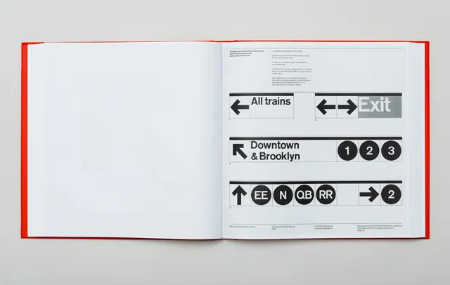
Open publication spread displaying iconic NYC subway directional signage design system with arrows, abbreviations, and numbered circles in bold sans-serif.
Summary
An open spread from a design system publication with NYC transit signage variations showing directional arrows, route abbreviations (EE, N, QB, RR), and numbered destination circles.
Visual description
Light background book spread with red border/binding edge on left. Right page shows multiple signage design variations: white signs with black arrows pointing left and right ("All trains" and "Exit"), stacked transit lines showing destination names ("Downtown & Brooklyn") with numbered circles (1, 2, 3) and line abbreviations arranged in rows. Clean sans-serif in medium weight. Grid-structured layout with annotations below each variation.
Key takeaway
Transit signage systems prioritize clarity through rigid grid structure and limited color. Bold arrows and clear hierarchy ensure legibility at a distance. Numbered circles and abbreviations create a consistent visual language.
Reuse notes
Reference for any modular signage, wayfinding, or information design systems. The grid-based layout and standardized marks are replicable. Adapt colors and typography for different contexts (museums, hospitals, retail). Documentation approach works well for design system presentations.
More like this



Keep what you find
A free account saves references to boards and can send you a weekly email of picks based on what you save.
To see every result, go Pro.