Preview image. Unlock full-res
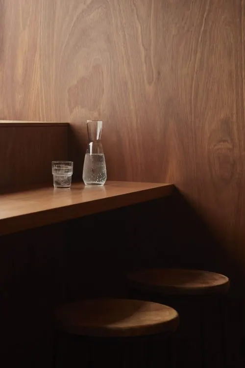
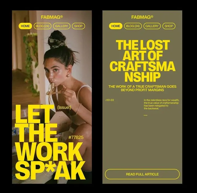
Editorial layout with earthy earth-tone palette and structured typography.
Summary
Editorial layout with earthy earth-tone palette and structured typography.
Visual description
A carefully composed visual reference showcasing thoughtful use of color, typography, and spatial arrangement. The palette emphasizes earthy tones with clear visual hierarchy. The composition demonstrates balanced spacing and intentional design choices that guide the viewer's attention.
Key takeaway
The balance between visual elements and use of negative space, creating sophisticated visual composition that avoids overcrowding while maintaining visual interest.
Reuse notes
Useful as a reference for editorial layouts, visual composition, and color harmony. The approach works well for projects requiring similar aesthetic restraint and sophistication. Pair with other references from the same collection for consistent stylistic direction.
More like this





Keep what you find
A free account saves references to boards and can send you a weekly email of picks based on what you save.
To see every result, go Pro.