Preview image. Unlock full-res
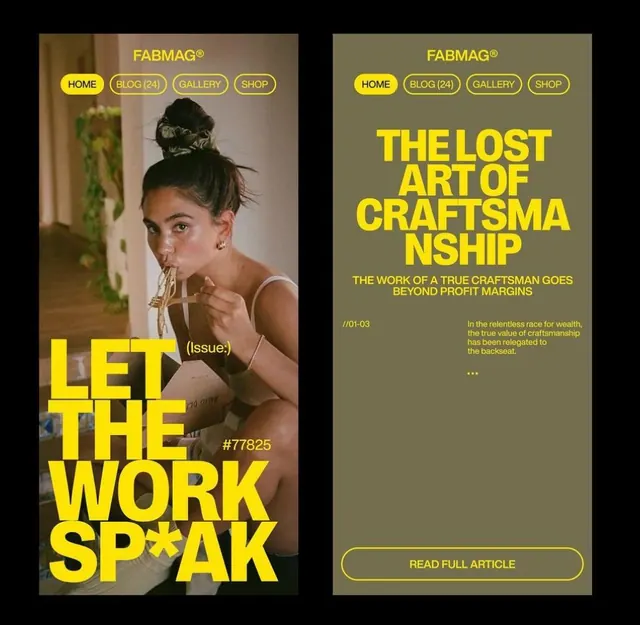
Two-column editorial spread with massive yellow sans-serif headlines layered over muted olive-brown tones and portrait photography.
Summary
Two-column editorial magazine spread using massive yellow sans-serif headlines layered over muted olive-brown photography and solid backgrounds, with yellow navigation pills and CTA button.
Visual description
Left column features a portrait of a woman holding food with the headline "LET THE WORK SPEAK" in oversized yellow all-caps type breaking across the photo and solid color areas. Right column shows "THE LOST ART OF CRAFTSMANSHIP" headline in the same bold yellow sans-serif above descriptive body copy and a "READ FULL ARTICLE" button outlined in yellow on an olive background. Both columns share FABMAG branding at top with yellow navigation buttons (HOME, BLOG, GALLERY, SHOP) and a hex color callout. The color palette stays limited to black, olive-tan, cream, and one bright yellow creating high contrast and visual hierarchy.
Key takeaway
Bold display type in a single accent color creates immediate visual hierarchy without needing multiple font weights. Yellow outlined buttons and navigation pills maintain brand consistency while staying scannable on warm earth-tone backgrounds. The two-column grid lets imagery and text coexist without fighting for attention.
Reuse notes
Effective for editorial and media sites needing bold visual impact with minimal color. Works well when the accent color (here yellow) can sit confidently over photography and muted earth tones. Scale the oversized headlines and button sizes up if the content area is large.
More like this

Keep what you find
A free account saves references to boards and can send you a weekly email of picks based on what you save.
To see every result, go Pro.